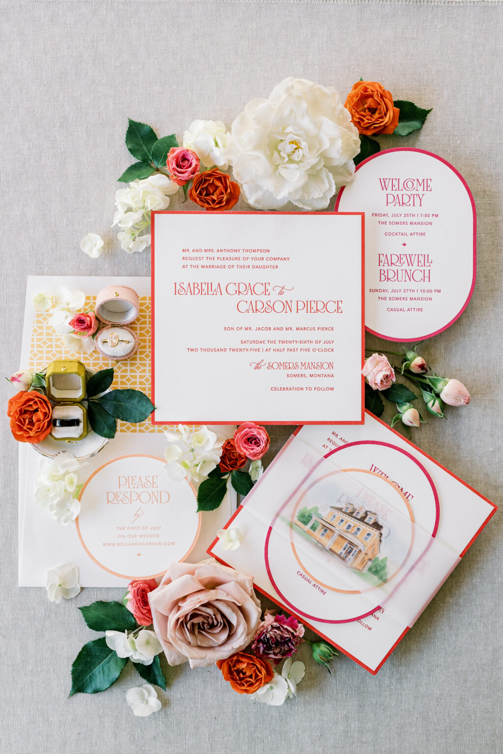
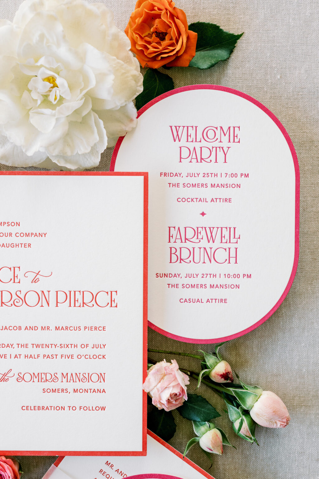
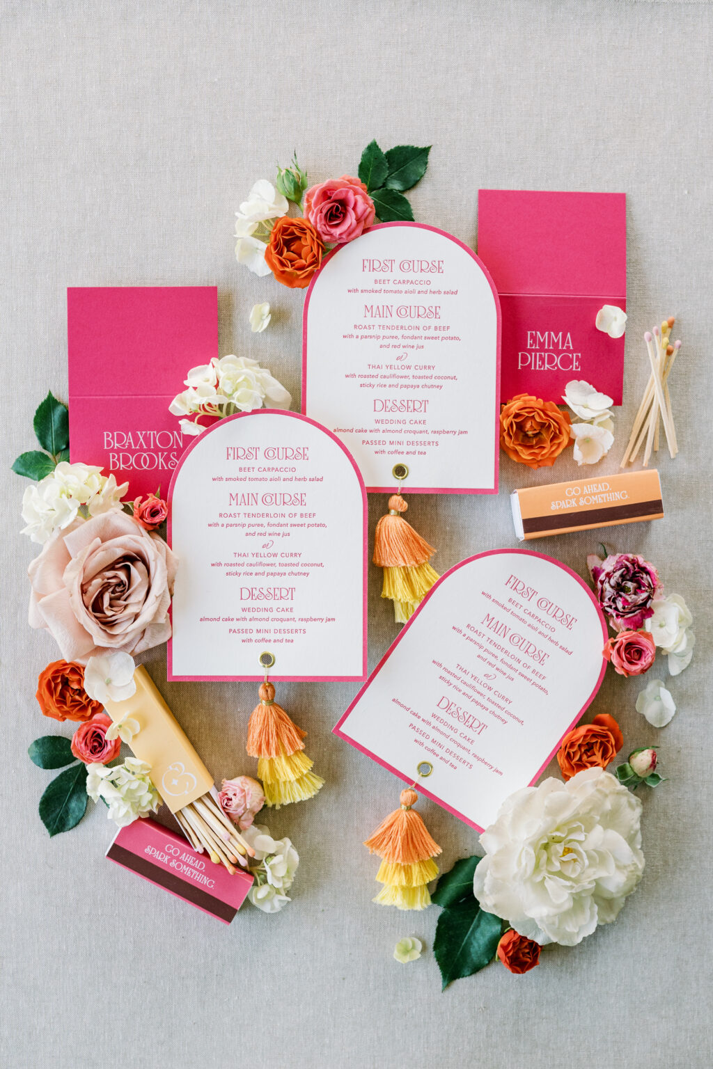
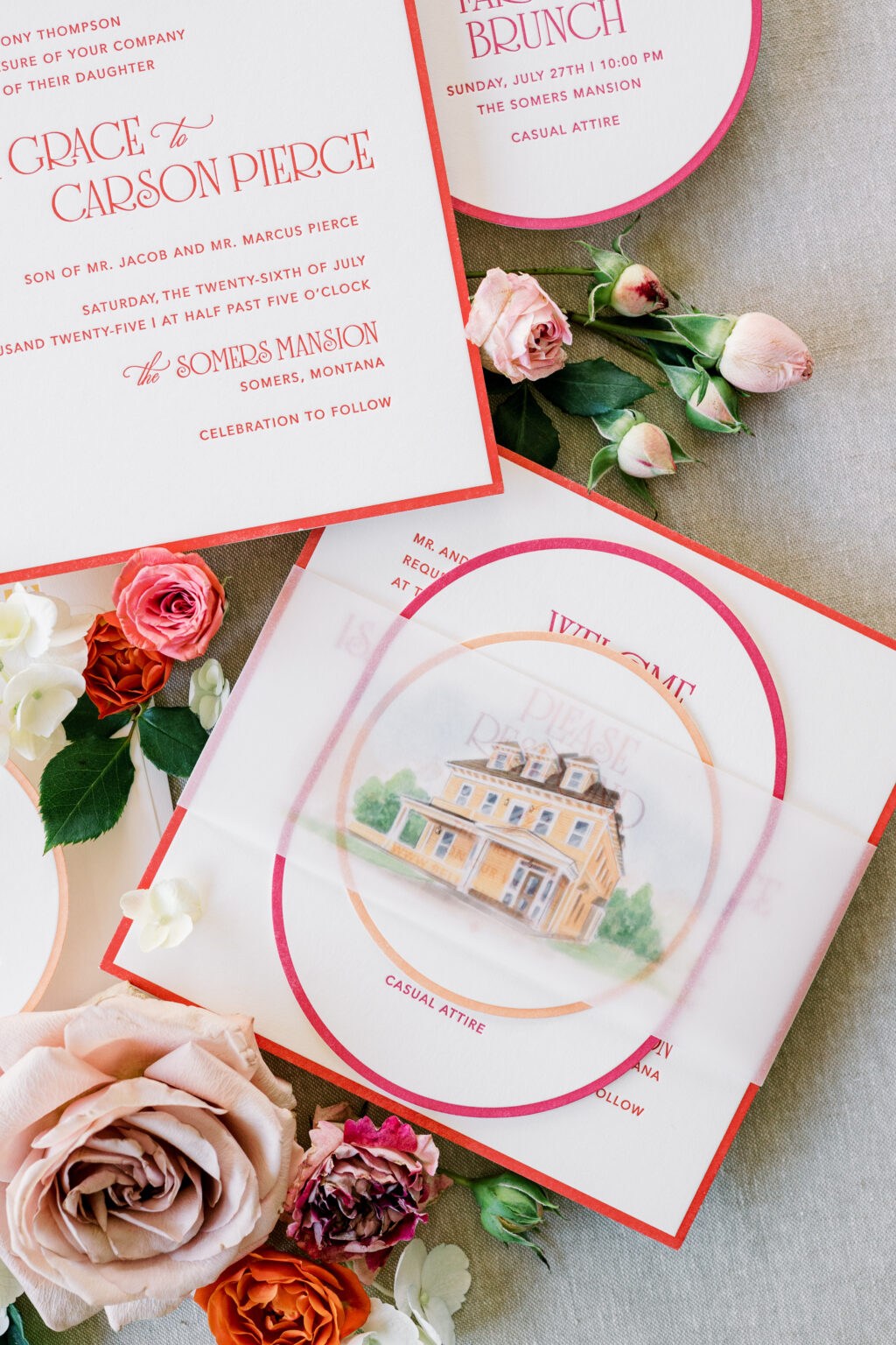
We have another one-of-a-kind design to share with you, courtesy of our friend Janeil of Seventh and Anderson. Not too long ago, we partnered with Janeil to create two wedding stationery suites for a styled shoot. We already highlighted the garden party-inspired design, and we cannot wait to share the second design, which features layered die-cut shapes, a vibrant color palette, and a watercolor illustration of the venue.
Invitation
letterpress ink: chili
fonts: avenir + solingen + ecatherina
papers: bella smooth cotton 2-ply white
card size: sq-7
envelope liner: lexsa pattern digitally in cmyk on white text
envelope: white text
job: 77887
This design is bold and modern, yet it still has an underlying romantic feel. The layout is traditional, but the whimsical font is contemporary and fun, while still maintaining a formal sense.
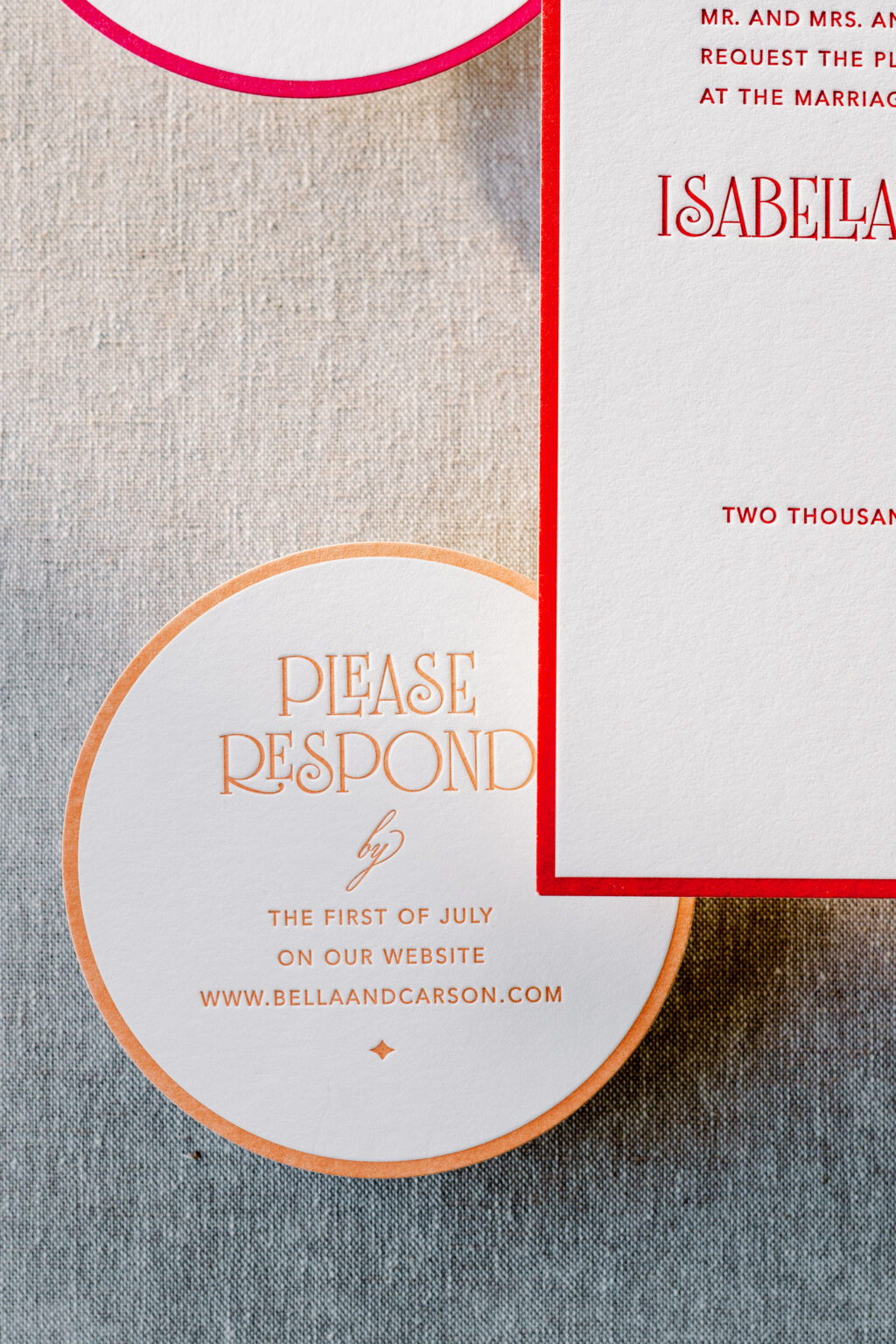
Reply Card
letterpress ink: persimmon
fonts: avenir + solingen + ecatherina
papers: bella smooth cotton 1-ply white
card size: 4-inch circle
die cut shape: sm-33
job: 77887
Each card in the suite is a different size and shape. The thick letterpress border on each card creates a cohesive element while highlighting the different shapes. Each card also features a different complementary color, further creating a sense of consistency while introducing vibrant energy and a cheerful, approachable vibe.
Details Card
letterpress ink: punch
fonts: avenir + solingen + ecatherina
papers: bella smooth cotton 1-ply white
card size: a-6
die cut shape: bf-113
job: 77887
The cards neatly stack and are secured together with a vellum belly band. A watercolor illustration of the venue is digitally printed on the belly band, adding a fun, personal touch.
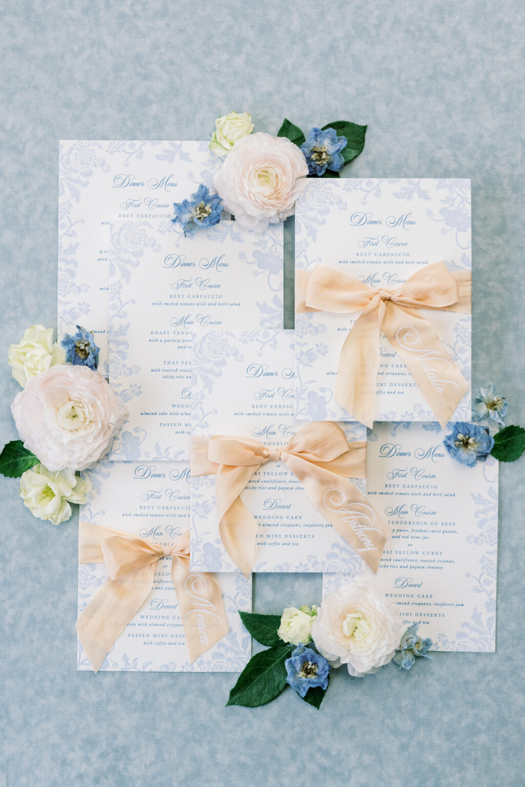
Menu
letterpress ink: punch
fonts: avenir + solingen + ecatherina
papers: bella smooth cotton 1-ply white
card size: a-6
die cut shape: cd-179
finishing: 0.25” hole drill and gold grommet
job: 77887
Folded Place Card
digital ink: white
fonts: avenir + solingen + ecatherina
papers: punch 1-ply
card size: no. 17 folded
job: 77887
Belly Band
digital: cmyk
papers: 40# vellum
card size: sq-7 (2.75” x 14.25” open, 2.75” x 6.74” closed)
job: 77887
This suite is cheerful, bold, and romantic. The design is perfect for a summer wedding at an estate or mansion. The look blends tradition with personality. It feels festive and welcoming, elegant but not overly formal, and very much made to celebrate.
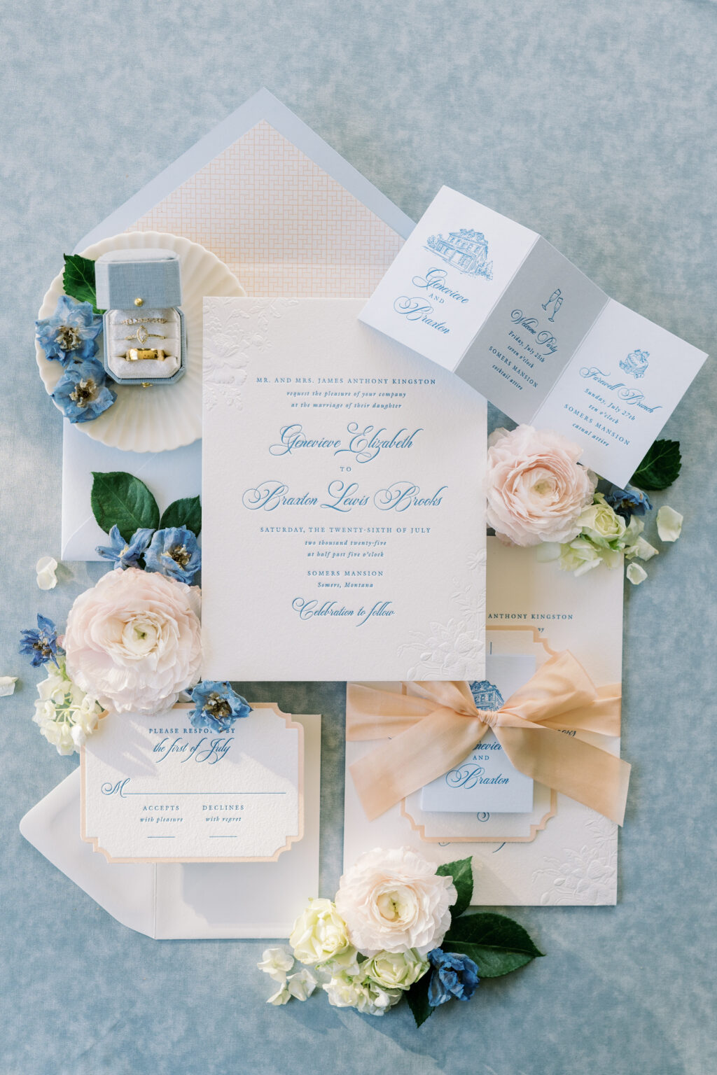
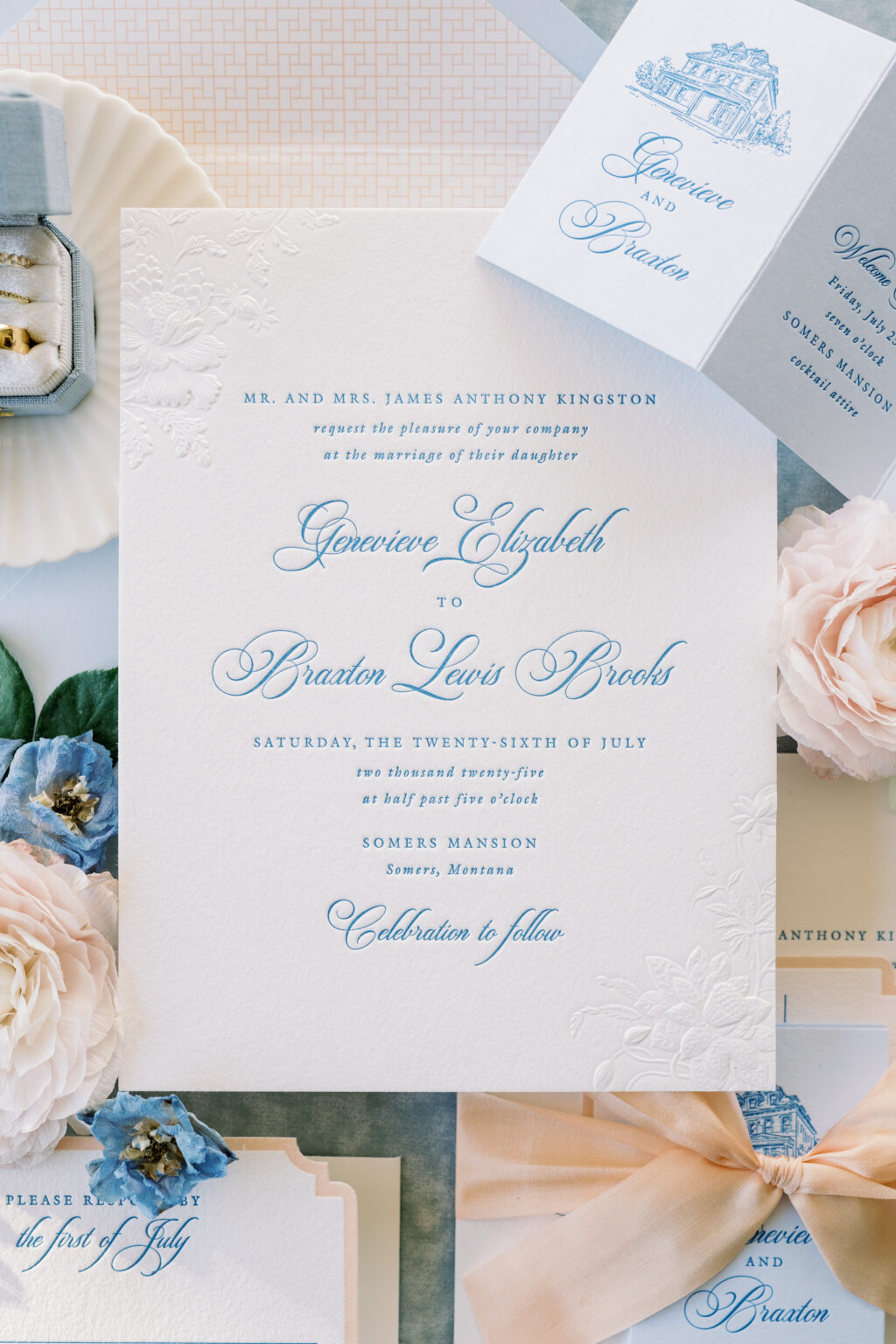
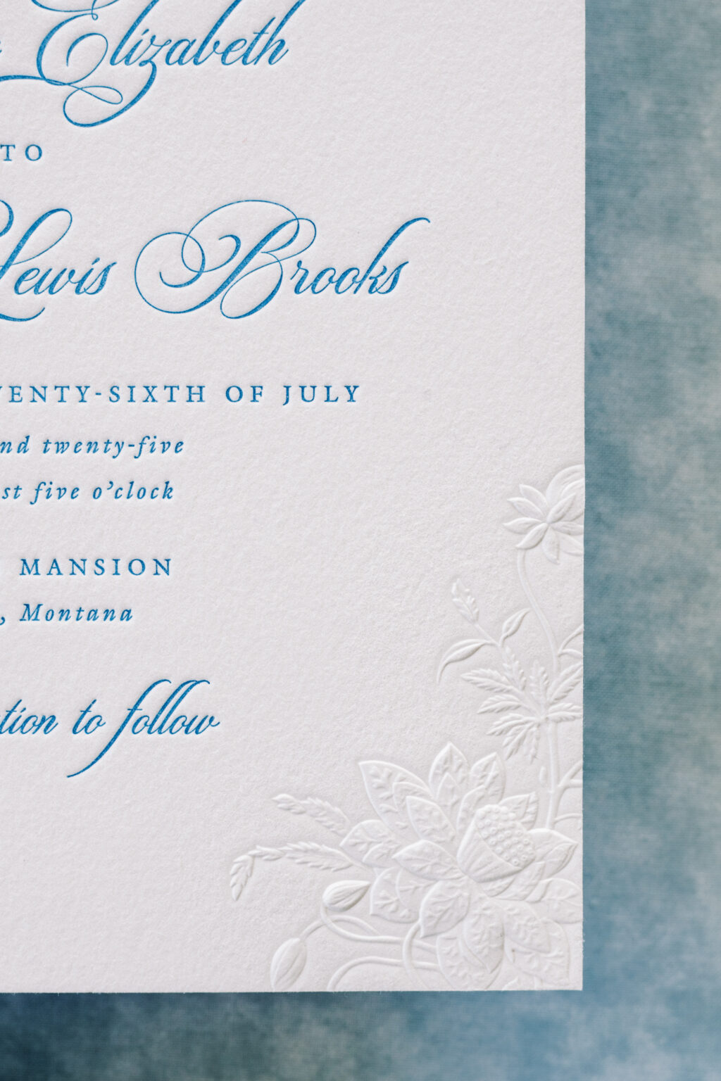
We had the pleasure of working with our dear friend Janeil of Seventh and Anderson to create two very different but equally lovely suites for a styled shoot. First up is a soft, romantic look that is timeless. Sculpted, embossed accents add stunning depth and a sense of luxury, while the delicate color palette is sophisticated and graceful.
Invitation
letterpress ink: wedgewood
sculpted emboss: blind
fonts: switzerland + galliard
papers: bella cotton 2-ply white
card size: f-8
silk ribbon: peach champage
finishing: assemble with ribbon
envelope liner: gywnn pattern digitally printed in bellini on white text
custom converted envelope: sky text
job: 77887
Reply Card
letterpress inks: wedgewood + bellini
fonts: switzerland + galliard
papers: bella cotton 1-ply white
card size: a-5
die cut style: lincoln
die cut shape: bf-13
job: 77887
This suite is inspired by a garden party with lots of refined elegance. The use of letterpress printing, which presses into the thick, luxurious stock, is juxtaposed with the sculpted, embossed floral pattern that serves as an accent. Embossing creates a raised impression, and sculpted embossing adds different heights within that raised area. This technique features a high level of detail, beautifully showcasing the intricacies of the flowers and foliage of the artwork.
Menu
letterpress inks: wedgewood + french blue
fonts: switzerland + galliard
papers: bella cotton 1-ply white
card size: a-7
job: 77887
These garden party invitations are a custom design, but they feature the same sculpted embossed plate from our Braxton V.2 design. While this invitation is very similar to the Braxton V.2 design, the overall look and vibe are different, and demonstrate how the details make a difference.
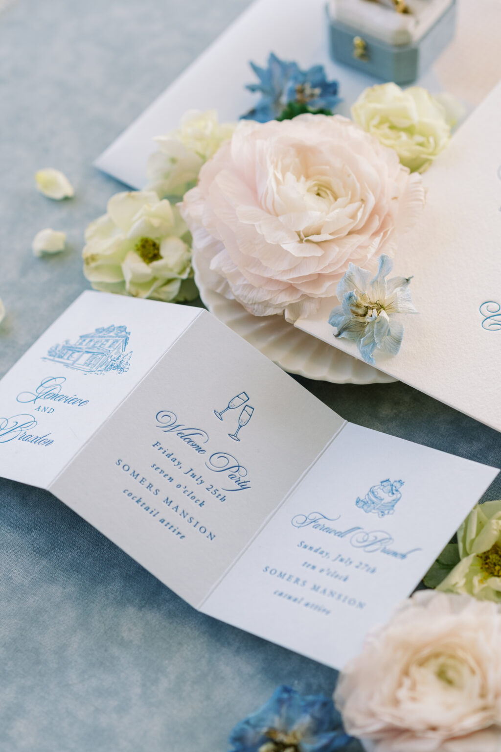
Details Card
letterpress inks: wedgewood
fonts: switzerland + galliard
papers: sky 1-ply
card size: z-fold card (7.5” x 3.48” open, 2.5” x 3.48” closed)
finishing: score
job: 77887
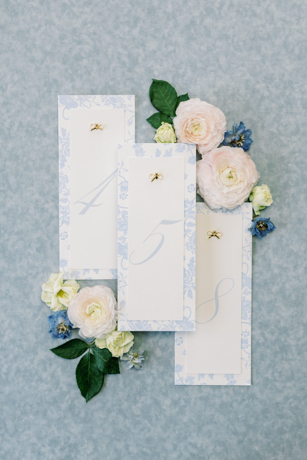
Pattern Card (backing for table numbers)
letterpress inks: french blue
fonts: switzerland + galliard
papers: bella cotton 1-ply white
card size: no. 10
job: 77887
This design is polished and romantic, perfect for a classic estate, mansion, or garden wedding with a formal yet warm atmosphere. It feels traditional without being stuffy, and luxe without being flashy. It was an absolute joy to work with Janiel on this design. Check back to see the second design, which takes things in a completely different yet still exciting direction.
We are so excited to share our brand-new wedding release with you! The 2026 release includes 30 new wedding designs and features lots of sculpted embossing, blind embossing, and debossing mixed with all of our print methods and papers. We added new engraving inks and lots of new die-cut shapes, additional piece enclosures, new envelope shapes, and mailers. Among these new and exciting offerings, the one that perhaps stands out the most is laser cutting.
There are so many eye-catching designs and lovely details. You can see everything new here, but keep reading to see some highlights from our latest wedding release.
Die Cut Shapes
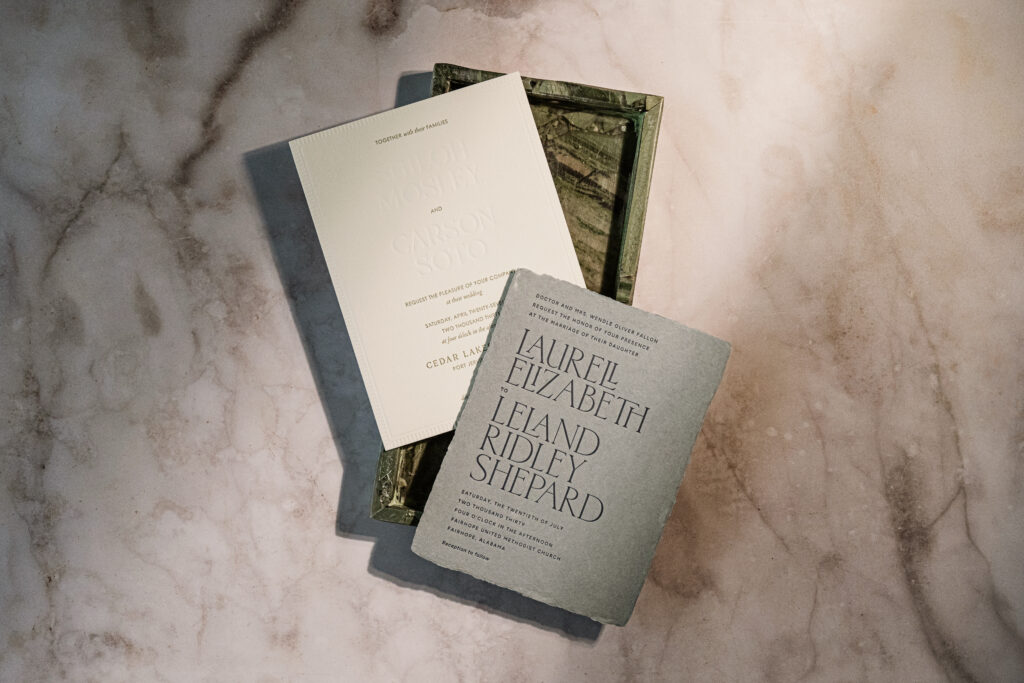
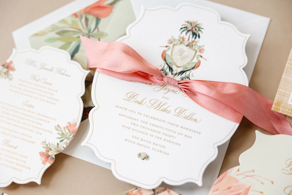
Die-cut shapes add character and a memorable touch to a card or the entire suite. We have a wide selection of die-cut shapes, and we can easily create new ones. Our 2026 wedding release includes lots of fun die cuts from the Yasmin and Valerie invitations or the reception card from the Monroe suite.
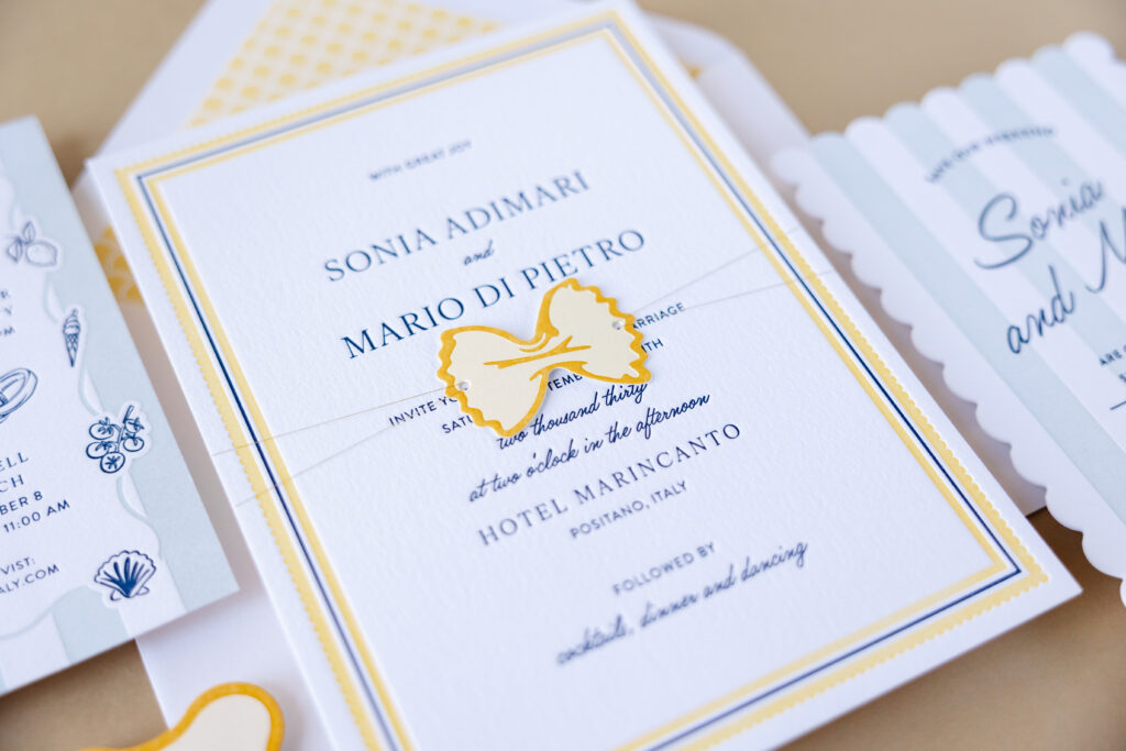
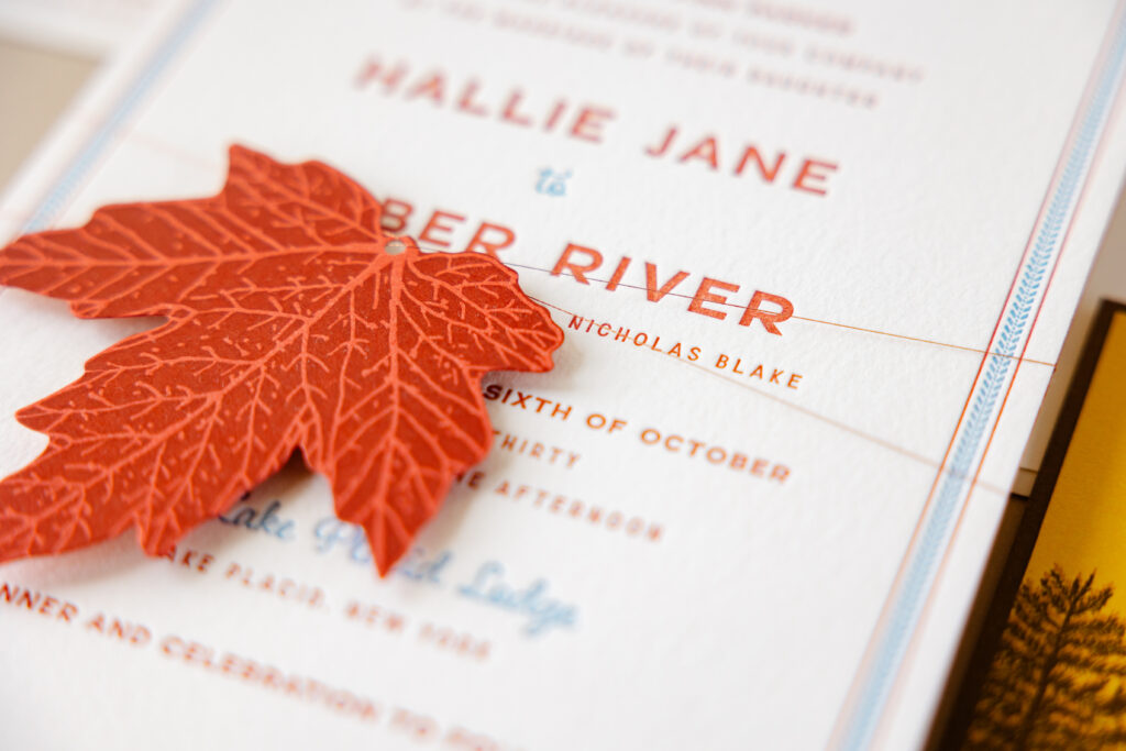
There are also lots of fun tags, from the farfalle-inspired tag of Italo to the maple leaf tag from Scout.
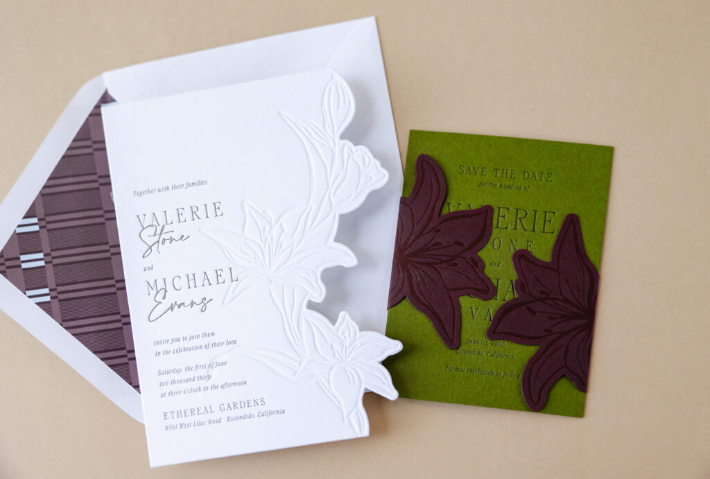
Sculpted Embossing
Sculpted embossing is a technique that creates a raised, dimensional surface. Our Delevingne suite is full of lovely instances of sculpted embossing. Detailed floral artwork on the invitation is subtle yet stately. New for this release, we’re also offering sculpted embossing for envelope liners, and the same floral pattern from the invitation is enlarged and appears on the liner.
Laser Cutting
We recently added laser cutting to our available print methods, and it has been tremendously fun and inspiring. This technique is excellent for creating patterns and highly detailed artwork. The belly band of the Vayda design is a stunning example of what we can do with laser cutting. You can also see laser cutting in action on the Talavera save the date, the extravagantly tropical pocketfold for Hiriata, and the moody pocketfold for Tomlin.
There is so much to see in this release, and these highlights are just some of the new offerings. Check it out to see all of the dreamy details. We are so happy to share this with all of you, and we hope you love it as much as we do!
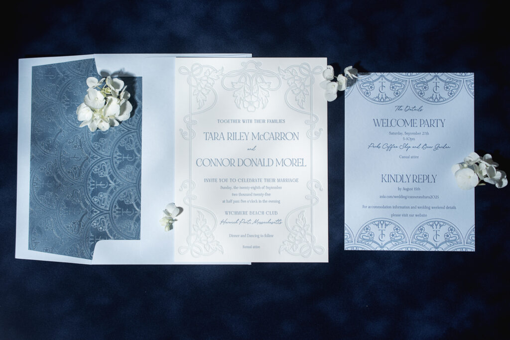
Art Nouveau refinement with a coastal flair ensures Tara and Conner’s ornate invitations, featuring a foil-stamped envelope liner, stand out for all the right reasons. This couple worked with our friend Colleen of Pen and Paper to customize our Matilde design for their summer wedding.
Invitation
letterpress inks: chambray + powder blue
font: noir et blanc regular + bigilla
papers: bella smooth cotton 2-ply white
card size: f-8
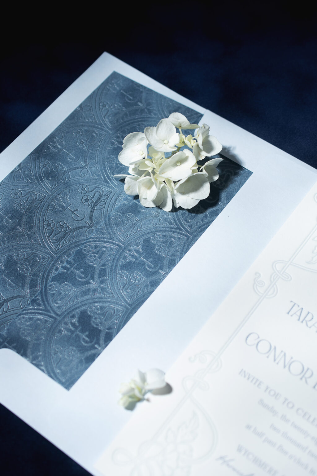
envelope liner: custom matilde monogram pattern foil-stamped in clear shine on french blue velvet
outer envelope: sky text
envelope addressing: yale digital on the front and the back
job: 77575
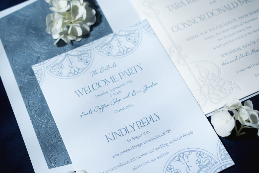
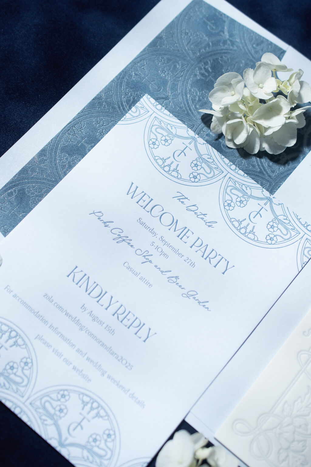
Details Card
letterpress ink: chambray
font: noir et blanc regular + bigilla
papers: bella sky 1-ply
card size: a-7
job: 77575
The scrolling frame surrounding the text has an organic, natural feel. Floral artwork elevates the look, creating an Art Nouveau vibe. Chambray letterpress ink introduces a muted coastal element, fitting for a wedding held in Cape Cod.
Tara and Conner’s details card borrows heavily from the original welcome party card, but adds a very personal touch. The neoclassical-inspired design is symmetrical and ornate, and was customized to include the couple’s initials within the pattern. The custom monogram effortlessly and flawlessly fits into the pattern.
The envelope liner showcases the same patterns, but this time, it’s foil-stamped in clear shine on our French blue velvet. The resulting envelope liner is subtle and tonal. The foil-stamped envelope liner is elegant, while the velvet adds a decadent texture to the overall design.
Do you daydream about romantic invitation designs that are quietly luxurious? Something polished and understated? Would you like to customize one of our patterns to include a personal detail, such as a monogram? Our dealers have a wealth of knowledge and design tips and can help you create the perfect invitations for your big day. Find a dealer and start creating your invitation design!
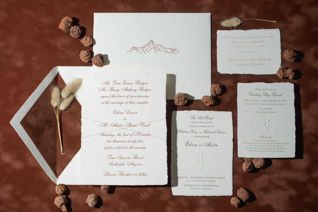
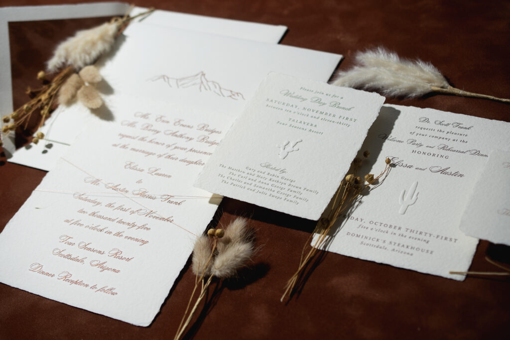
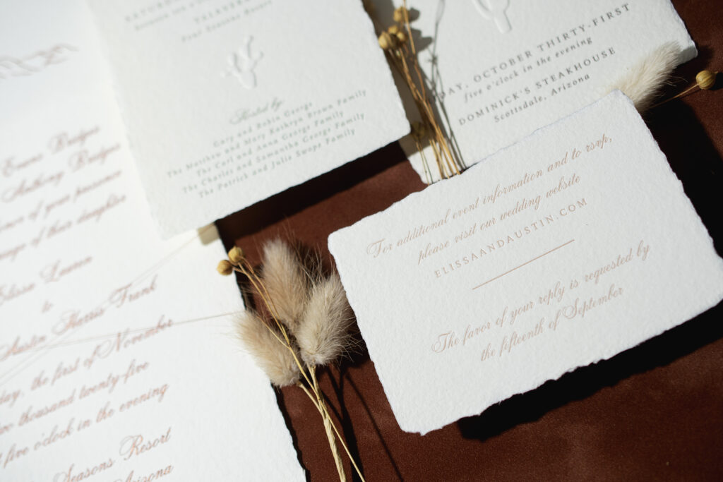
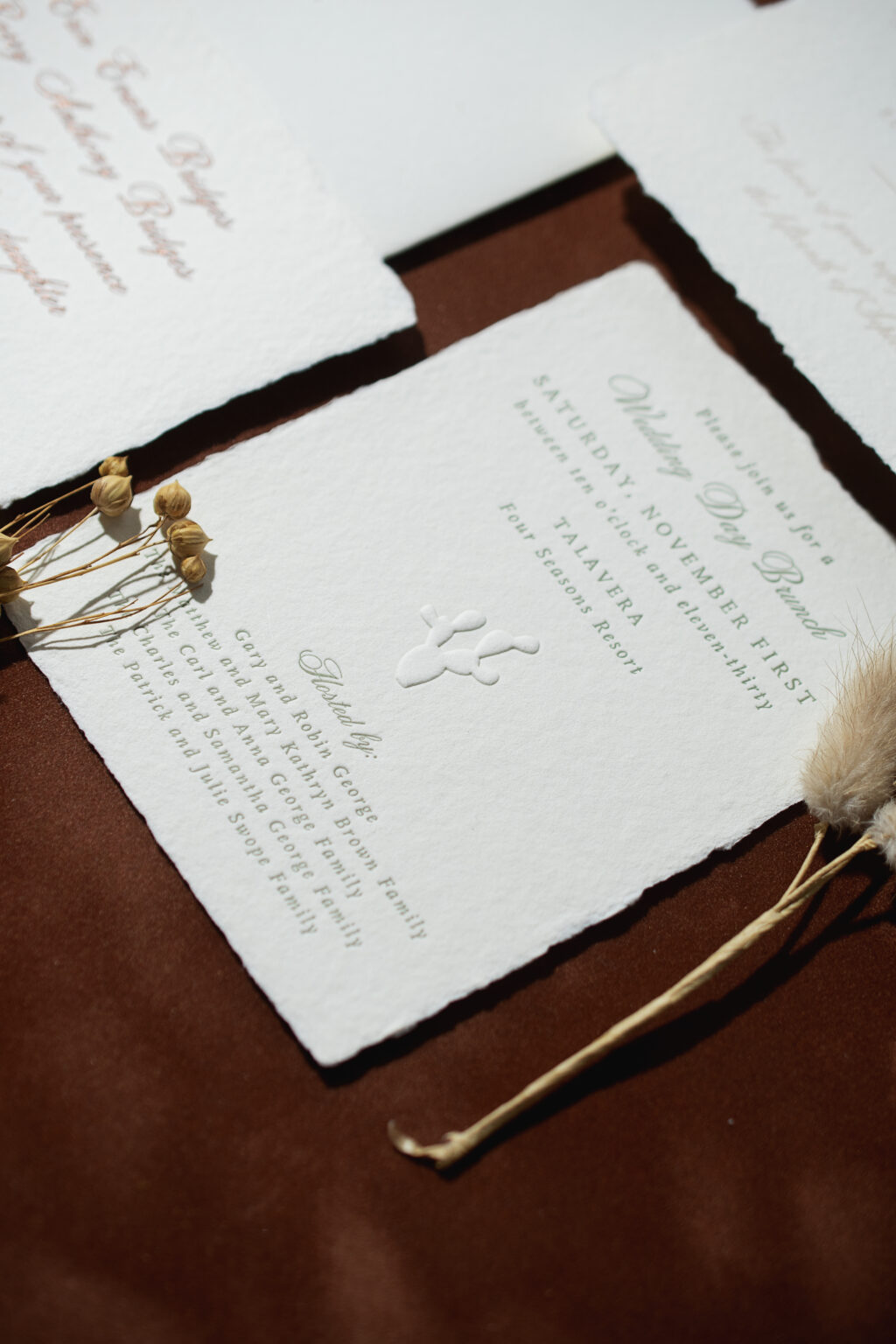
Elissa and Austin’s wedding stationery perfectly blends different styles into a beautiful, cohesive suite that is completely custom and personal. A soft, earthy color palette, handmade paper, and velvet had us swooning. We worked with our friend Trisha of Shindig Paperie in Fayetteville, Arkansas, to create these romantic, minimalist engraved invitations for Elissa and Austin’s nuptials.
Invitation
engraving ink: metallic copper
font: citadel script
papers: bella handmade ivory
card size: f-8 deckle edge
thread: metallic copper
finishing: assemble with thread
envelope liner: mocha velvet (no printing)
inner envelope: bella handmade ivory pointed flap
inner envelope printing: nutmeg letterpress on the front
custom converted outer envelope: ivory cotton text pointed flap
envelope addressing: nutmeg letterpress on the back
job: 75761
The invitation design is traditional with engraving on our handmade paper. Metallic copper ink adds a touch of sparkle to the very stately invites while adhering to the cozy, sun-baked color palette of the overall design.
The inner envelope is also made from our handmade paper in ivory, complete with deckle edges along the pointed flap. A velvet liner adds warmth and even more texture. The minimalist artwork on the front of the inner envelope, letterpress printed in nutmeg ink, nods to the landscape surrounding the wedding destination.
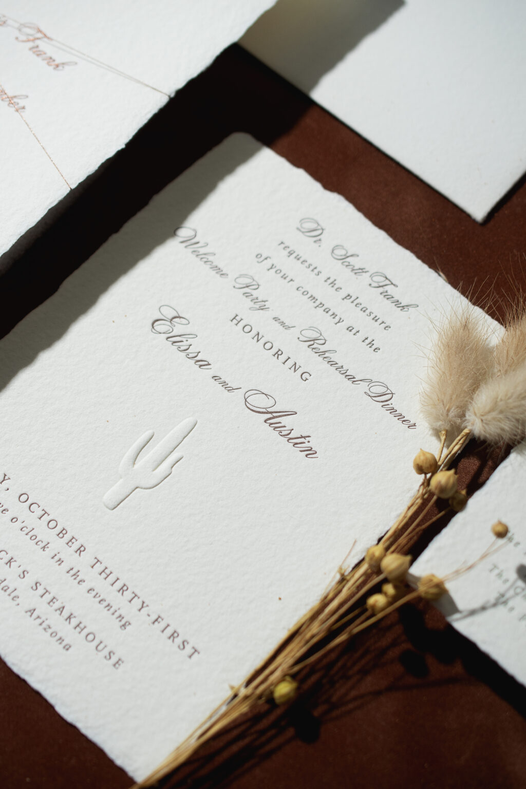
Rehearsal Dinner Invitation
letterpress ink: ganache
emboss: blind
font: citadel script + scala medium + scala pro italic
papers: bella handmade ivory
card size: a-6 deckle edge
job: 75761
Details Card
letterpress ink: tea rose
font: citadel script + scala medium
papers: bella handmade ivory
card size: a-5 deckle edge
job: 75761
The rehearsal dinner invite and brunch card add some whimsy with blind-embossed Saguaro and prickly-pear cacti. This artwork again sets the tone for the desert location while maintaining the design’s elegant, minimalist vibe.
Brunch Card
letterpress ink: spruce
emboss: blind
font: citadel script + scala medium + scala pro italic
papers: bella handmade ivory
card size: a-2 deckle edge
job: 75761
These engraved invitations were a lot of fun to work on and expertly merged tradition and luxury with elevated Western style. Have you been daydreaming about velvet envelope liners or fun, blind emboss accents? Contact one of our dealers to receive stellar tips and advice to create your custom wedding invitations.
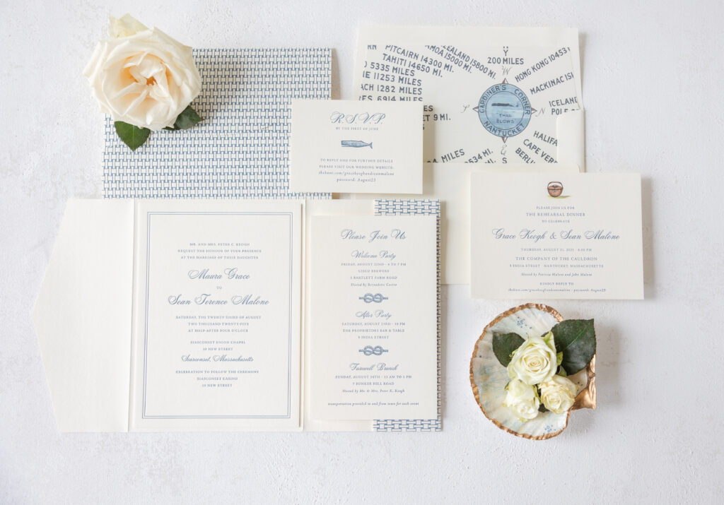
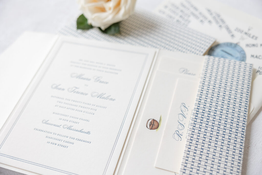
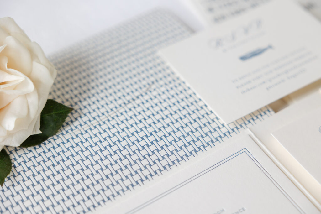
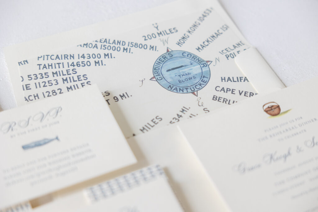
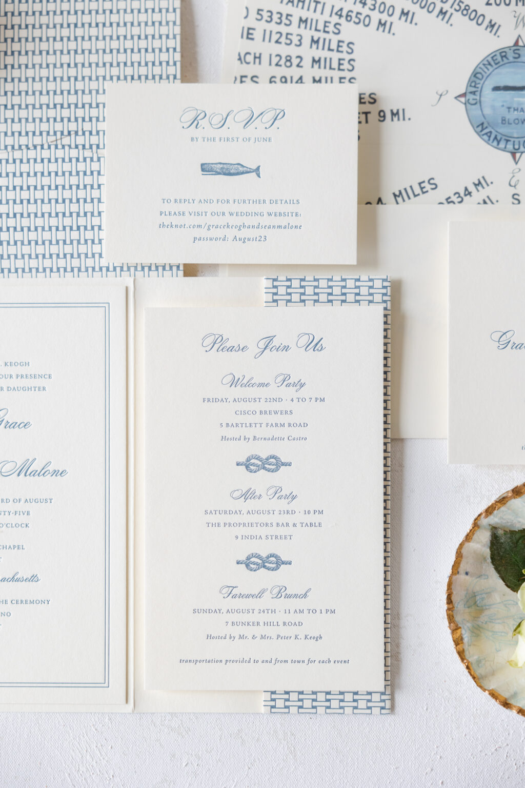
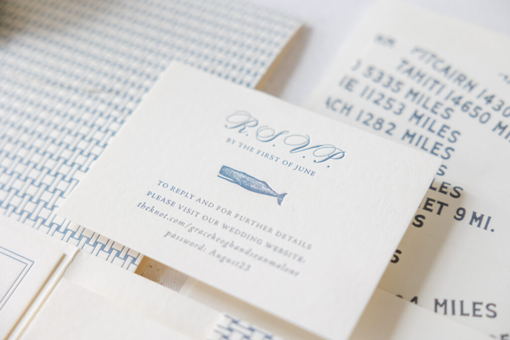
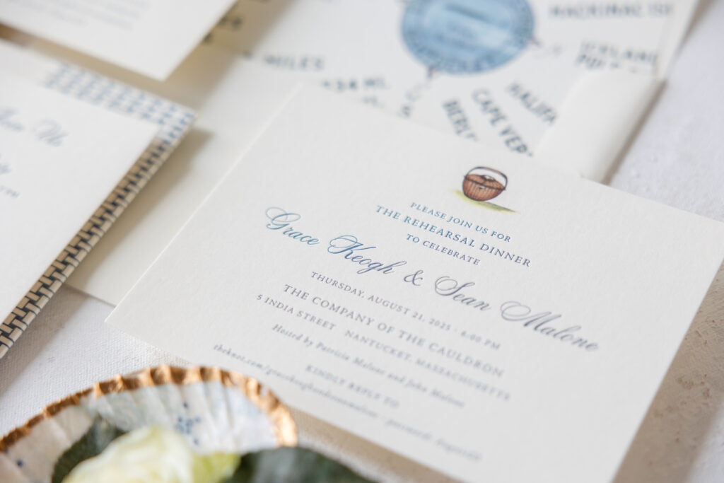
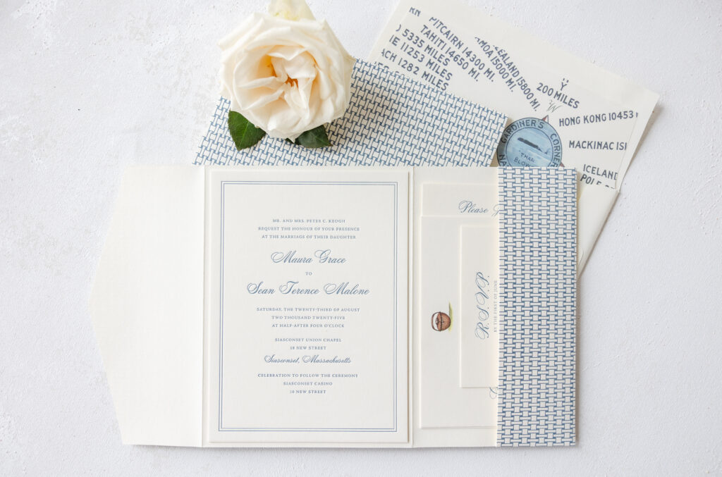
Classic coastal elegance meets East Coast style, and fun, nautical details in Maura and Sean’s letterpress wedding stationery. This couple worked with our friend Heidi from Parchment Fine Papers to craft their custom invitations.
Ivory 2-ply smooth cotton paper holds a deep letterpress impression. The paper showcases the graceful swirls of the script font used for the bride and groom’s names. The double-line border adds a refined, traditional look that complements the formal layout and typography. Navy ink establishes an undeniably nautical vibe that carries across each piece in the suite.
size: f-8 horizontal self-closing pocketfold (8.27” x 14.57” open, 8.27” x
6.16”)
job: 74707
The custom liner depicts the beloved compass rose mural in downtown Nantucket, fitting for a ceremony held on this tiny Massachusetts island.
Rope knots add a subtle maritime touch to the details card, while the whale motif on the reply card is fun and fully embodies the New England seaside aesthetic.
All of the cards are secured in a coastal-inspired pocketfold adorned with a woven lattice pattern on the exterior. The pattern adds texture while maintaining the whimsical yet upscale coastal feel.
Maura and Sean’s wedding stationery epitomizes summer in coastal New England. The overall design is timeless and graceful while giving a deliberate yet subtle nod to maritime tradition. Are you looking for ways to incorporate local details into your wedding stationery design? Would a pocketfold be the perfect way to organize various cards and help set the theme for your big day? We can help! Contact us to learn more about our design process or work with one of our highly experienced dealers to receive tips and assistance.
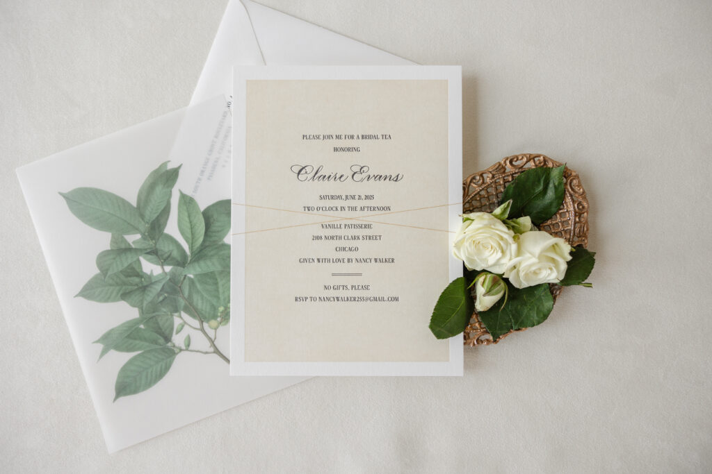
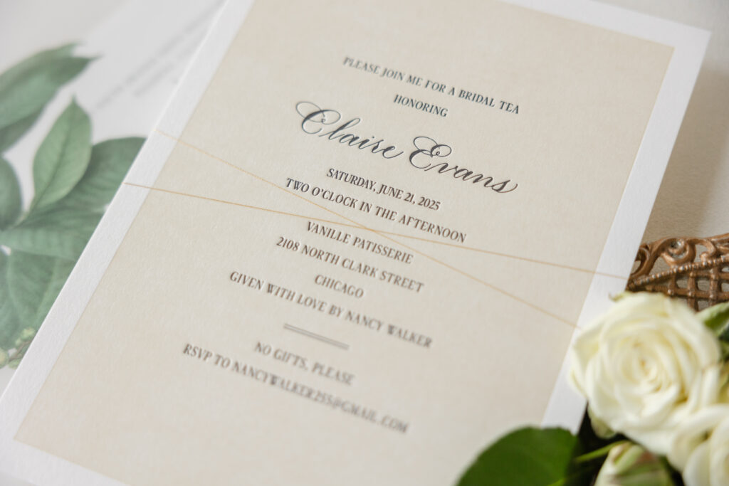
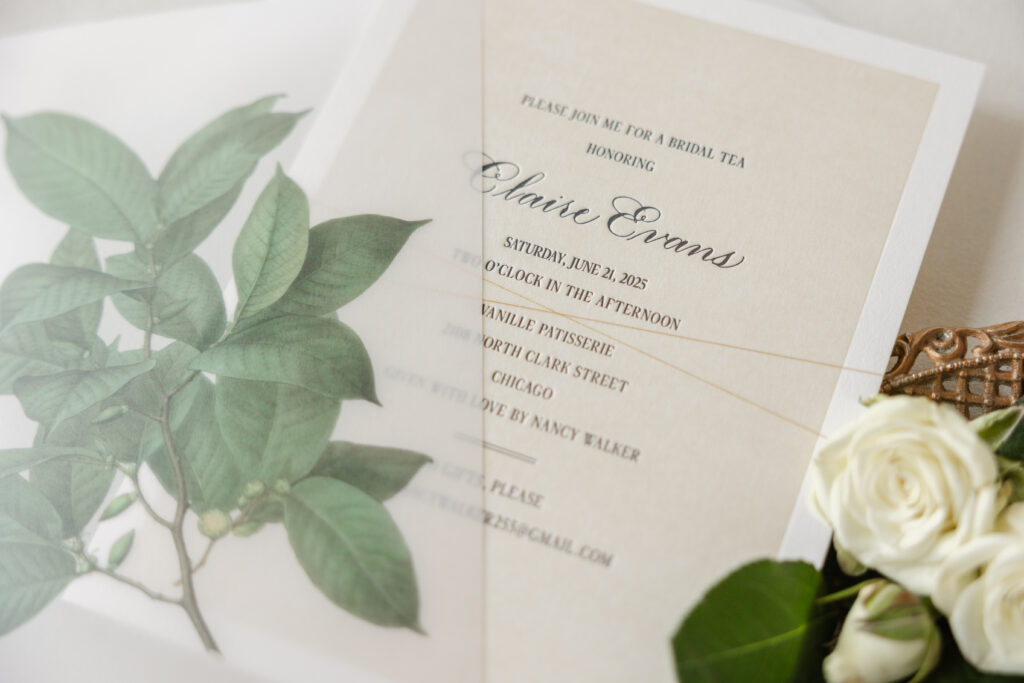
The soft, romantic style of these bridal tea invitations is elevated by hand calligraphy and a vellum overlay. We worked with our dear friend Allison from Salutations Home to create these darling invitations for a tea honoring bride-to-be, Claire.
Hand calligraphy is a time-honored tradition that is always unique. This invitation features Rook hand calligraphy by Nicole Black. The understated hand is stylish and discerning and pairs beautifully with the delicate serif font.
The invitation is printed on our Smooth Cotton 2-ply in white for a thick, pillowy texture. All but a thick border surrounding the edges is printed in a flood of our sand letterpress, with all of the text, including the hand calligraphy, appearing in black letterpress. The flood of letterpress printing creates the look of a color paper, while maintaining the sense of generous empty space and reinforcing a neutral, organic feel.
Invitation
letterpress inks: black + sand
hand calligraphy: Rook
font: dark paradise
papers: smooth cotton white 2-ply
card size: f-8
envelope: pointed flap white cotton text
envelope addressing: black digital on the front and the back
job: 76686
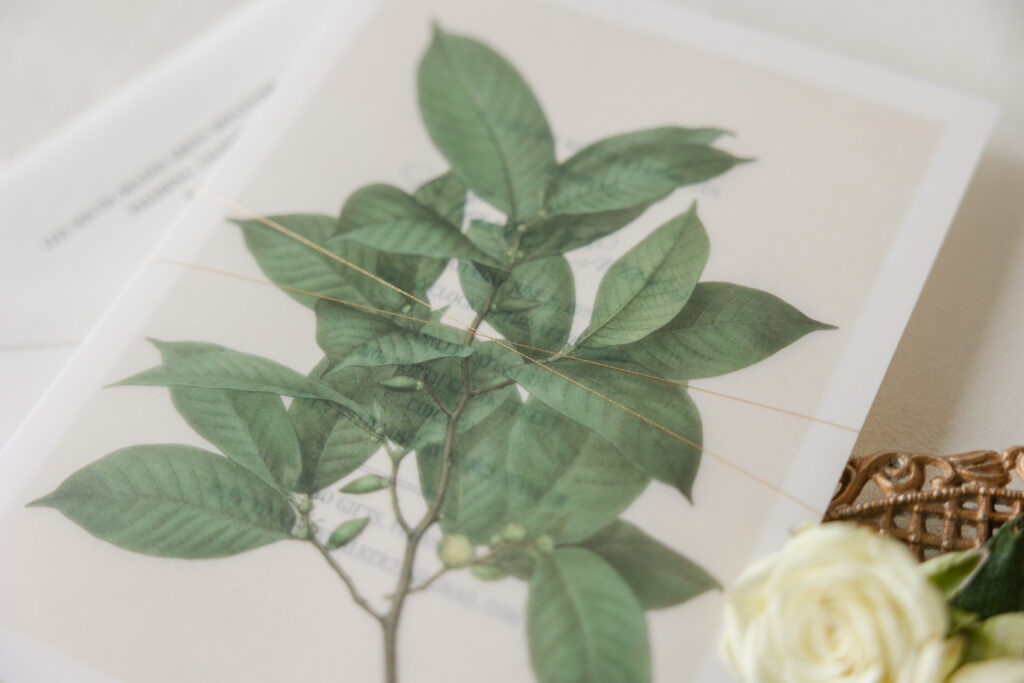
Overlay
digital: cmyk
papers: 40# vellum
size: f-8 overlay (8.31” x 6.19”)
thread: gold metallic
finishing: assemble with the invitation and thread
job: 76686
The botanical artwork of the overlay softens the formality and introduces a natural, garden-inspired touch. The overlay is held in place over the invitation with metallic gold thread for a touch of shimmer.
Overall, this style would be best described as classic romantic with botanical elegance. The look is perfect for a bridal tea, garden weddings, or any event aiming for a graceful quietly luxurious tone. Do you want to include hand calligraphy in your design? Or would a vellum overlay provide that extra something to elevate the look you want? Work with one of our dealers to create the perfect invitations for your event.
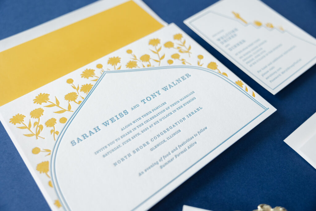
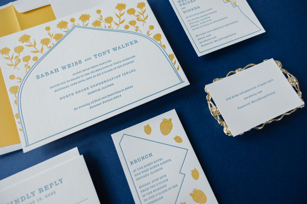
Sarah and Tony’s wedding invitation suite blends traditional wedding formality with contemporary design sensibility. The couple worked with our dear friend Colin from Pulp and Ink to create these modern heirloom wedding invitations.
Structured arches and framed panels nod to classic architecture and subtle Art Deco geometry, lending balance and ceremony to each piece. Each unique border represents the iconic and distinctive shapes of the buildings hosting the various events of the wedding weekend. This is a touching personal detail that makes the design extremely unique to the couple.
Invitation
letterpress inks: goldenrod + wedgwood
fonts: clarendon text
papers: smooth cotton white 2-ply
card size: f-8
envelope liner: goldenrod text (no printing)
envelope: white cotton text
envelope addressing: wedgewood digital on the front and the back
job: 75208
Reply Card
letterpress ink: wedgwood
fonts: clarendon text
papers: smooth cotton white 1-ply
card size: a-5
envelope: white cotton text
envelope addressing: wedgewood digital on the front
job: 75208
The pairing of our Goldenrod and Wedgewood letterpress inks feels elegant and airy, while carrying a sense of timelessness. The formal and relaxed serif font and generous spacing are refined and modern.
Welcome Card
letterpress inks: goldenrod + wedgwood
fonts: clarendon text
papers: smooth cotton white 1-ply
card size: a-2
job: 75208
Brunch Card
letterpress inks: goldenrod + wedgwood
fonts: clarendon text
papers: smooth cotton white 1-ply
card size: a-5
job: 75208
Website Card
letterpress ink: wedgwood
fonts: clarendon text
papers: smooth cotton white 1-ply
card size: 4” x 2.75”
job: 75208
The motifs across the invitation, welcome card, and brunch card are printed in a heavy flood of color, creating a decorative summer vibe with hints of old-world charm.
Are you interested in subtle details that elevate the design of your wedding invitations? Do you want something custom that showcases your love story? Work with one of our dealers to receive expert guidance and assistance to create truly memorable invitations.
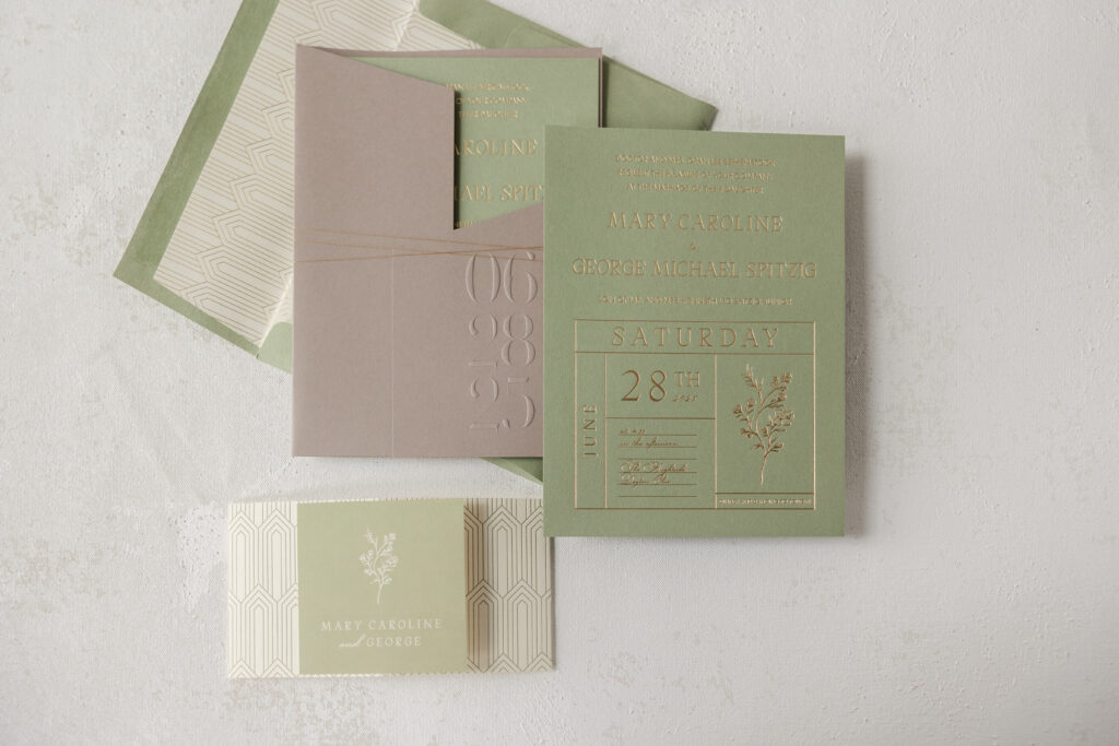
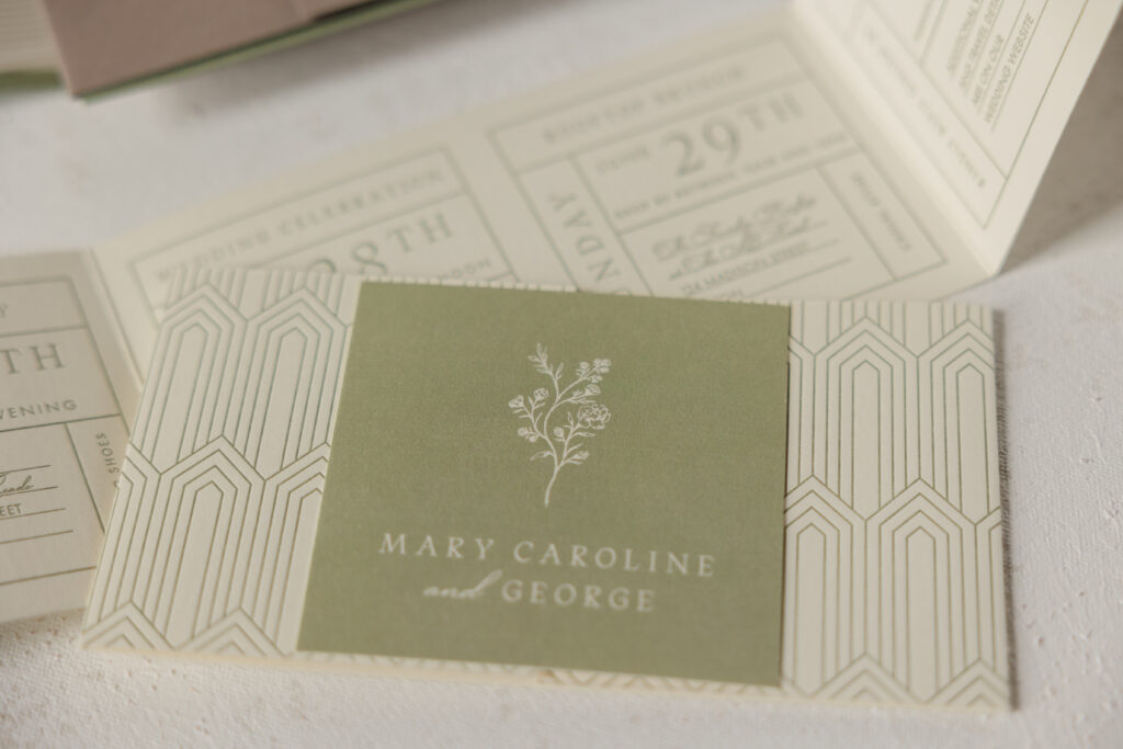
A muted, earthy color palette, paired with foil stamping and botanical details, gives Mary and George’s invitation set a luxurious, organic feel. This couple worked with our dear friend Lindsey from Mrs. Post Fine Stationery & Gifts to customize our Apothic design. While they kept many elements, they did a wonderful job transforming and reimaging the original design to reflect their style.
Invitation
foil stamping: champagne matte
fonts: gatlik saphir + futura + ed cretheus
papers: spruce 2-ply
card size: 6.04” x 8.06”
envelope liner: sherah pattern foil stamped in champagne matte on ivory text
custom envelope: spruce text
envelope addressing: black digital on the front and the back
job: 75534
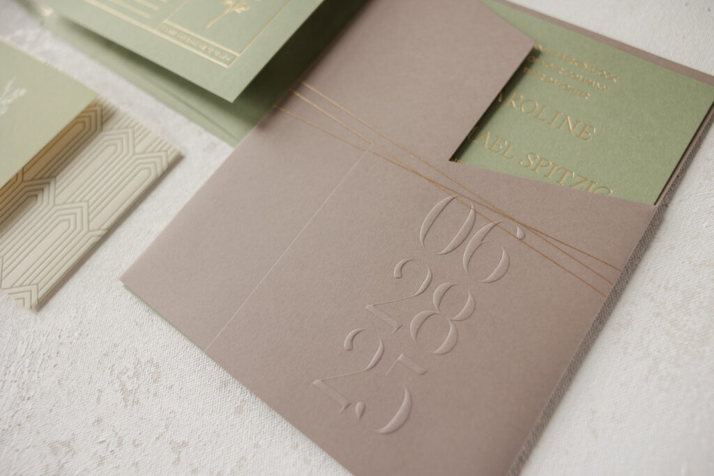
Gatefold Wrap
emboss: blind
papers: sable 1-ply
size: 13.6957” x 8.31” open, 6.24” x 8.31” folded
die cut shape: cd-538
thread: metallic gold
finishing: assemble with the cards inside and secure with the thread
job: 75534
The invitation feels refined and modern. The grid-style look brings order and structure and feels very composed and intentional, while the serif and script fonts, along with the floral sprig accent in the bottom right corner, give the design a more personal and romantic feel. Our spruce paper is warm and muted, allowing the champagne matte foil to stand out without being flashy.
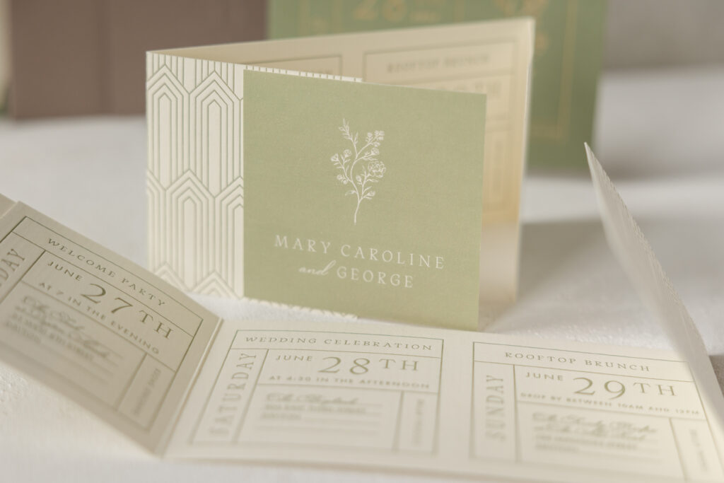
Details Card
letterpress ink: spruce (front) / spruce (back)
fonts: gatlik saphir + futura + ed cretheus
papers: bella smooth cotton 1-ply ivory
card size: 13” x 3.5” open, 6.5” x 3.5” closed
job: 75534
Details Card Tag
digital ink: spruce
fonts: gatlik saphir + ed cretheus
papers: bella smooth cotton 1-ply ivory
card size: 3.38” x 3.38”
finishing: mount to the exterior of the details card
job: 75534
The Art Deco-inspired envelope liner uses the same foil color and mimics the feel of the invitation’s grid layout. The foil-stamped pattern repeats on the back of the details card, adding continuity to the design. The multi-panel details card is a very functional piece that includes a timeline of events, while the last panel serves as a reply card. The tag adhered to the front of the details card coordinates with the invitation since it features the same paper and floral artwork.
All of the cards fit inside the gatefold wrap. This folder-like piece neatly secures the cards, ensuring an orderly presentation. Metallic gold thread is the finishing touch that holds the gatefold closed. It was a pleasure to create Mary and George’s invitation suite. Is your style modern botanical elegance or more modern classic? Are you looking for the right invitations for your big day? Visit one of our dealers to get help and guidance in designing your perfect wedding invitations.
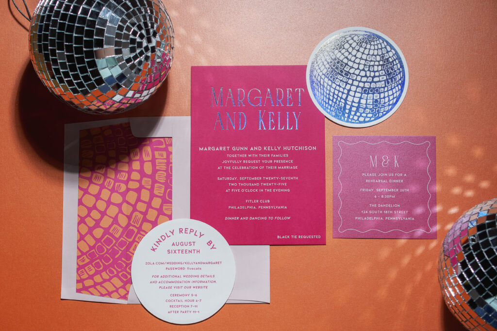
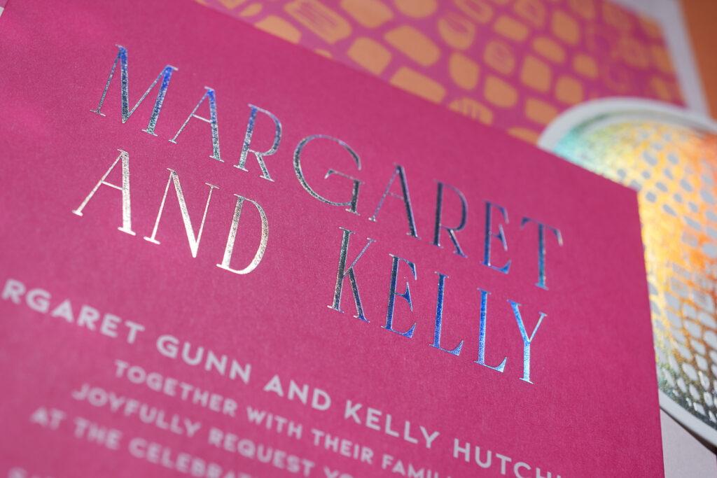
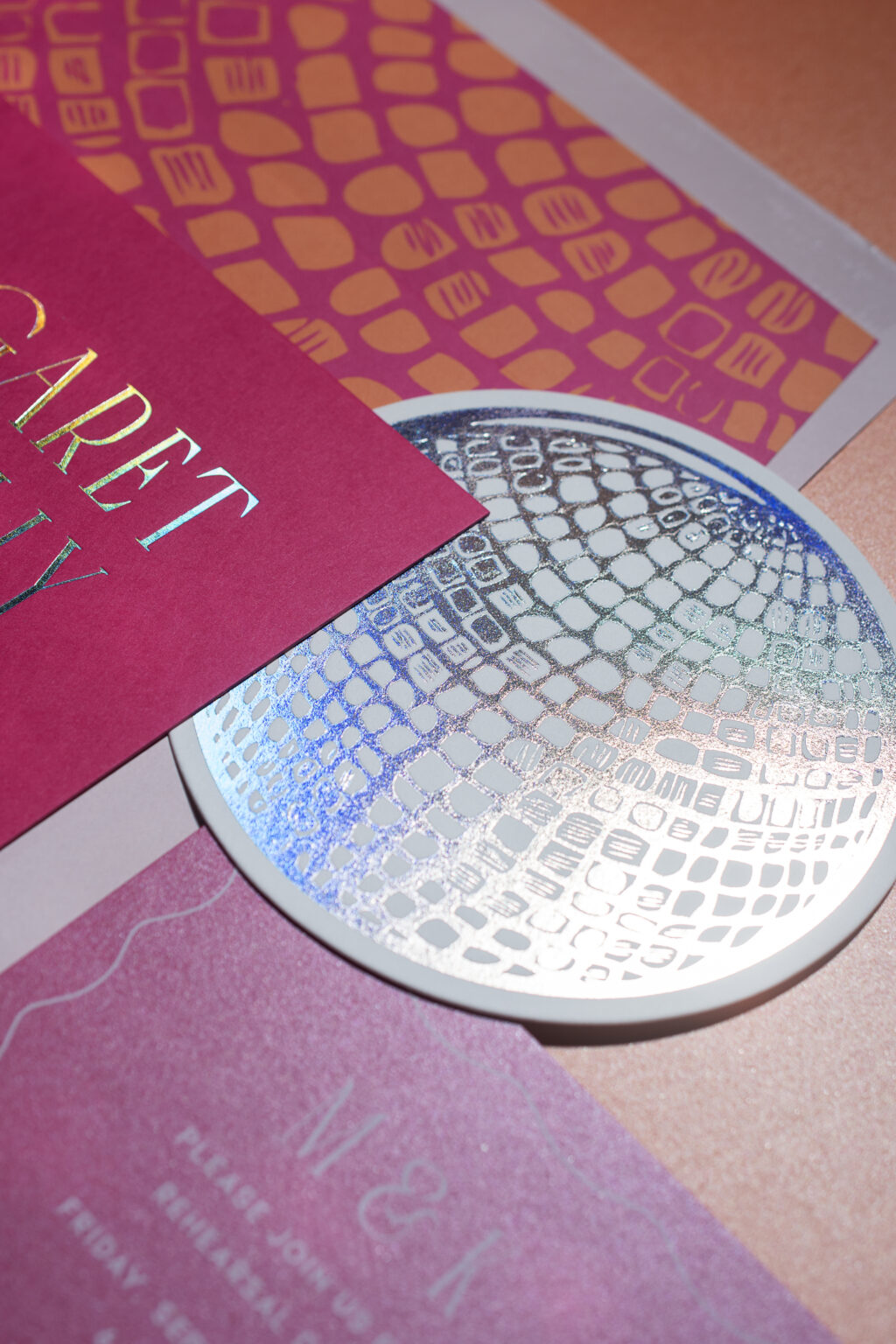
If you imagined a design that was modern and contemporary, but infused with a touch of nightlife energy, then Margaret and Kelly’s wedding invitations would be what you envisioned. This lovely couple worked with our dear friend Colleen of Pen and Paper to create their sleek black-tie invitations, which also feature bold, saturated hues and disco details.
Invitation
foil stamping: prism shine
digital ink: white
fonts: grelish + kiona bold
papers: punch 2-ply
card size: f-8
envelope liner: custom pattern digitally printed in punch + persimmon on white text
custom envelope: ballet text
envelope addressing: punch digital on the front and the back
job: 77555
The invitation features the couple’s names in our prism shine foil on our 2-ply punch paper. The combination of the shimmery prism shine foil and bright paper sets a fun, whimsical tone. The remaining text is digitally printed in white. The text is further delineated by the use of a serif font for Margaret and Kelly’s names, while the rest of the text appears in a sans serif font. Clean lines and contemporary typography make these invitations modern and fitting for a black-tie event. The bold color palette and metallic accents add movement and evoke a party vibe. The envelope liner leans more towards a party sentiment, with disco ball-inspired artwork digitally printed in punch and persimmon inks.
Reply Card
foil stamping: prism shine (front)
digital ink: punch (back)
fonts: kiona bold
papers: bella smooth cotton 1-ply white
card size: 4.75” diameter circle
die-cut shape: bp-6
job: 77555
Rehearsal Dinner Invitation
digital ink: white
fonts: grelish + kiona bold
papers: metallic azalea1-ply
card size: sq-5
job: 77555
The reply card is full on party with a disco ball foil stamped in prism shine on one side and text digitally printed on the reverse. The rehearsal dinner invitation features our metallic azalea stock in 1-ply, introducing a subtle shimmer.
These invitations are fun, confident, and fabulous. The design beautifully merges modern and playful elements to create a high-fashion style. Are you interested in chic, playful, and glamorous wedding invitations? We can help make that happen. Locate one of our dealers, and they can show you samples and swatches and provide expert guidance to help you design your dream invitation suite.
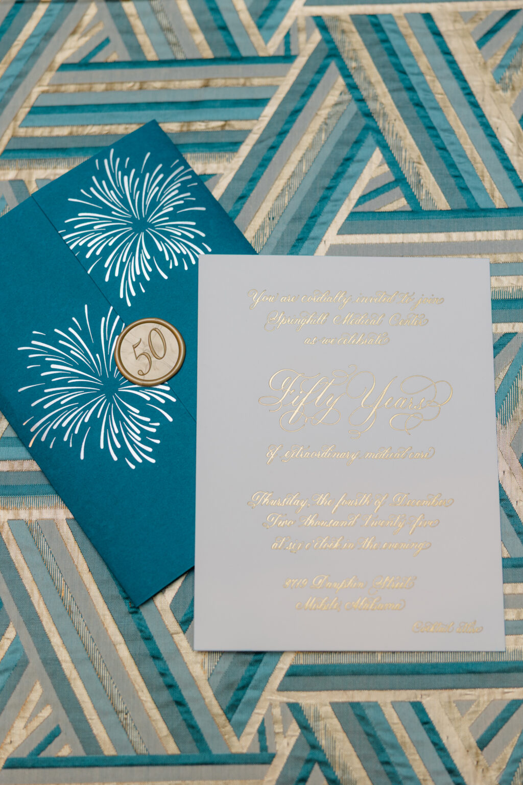
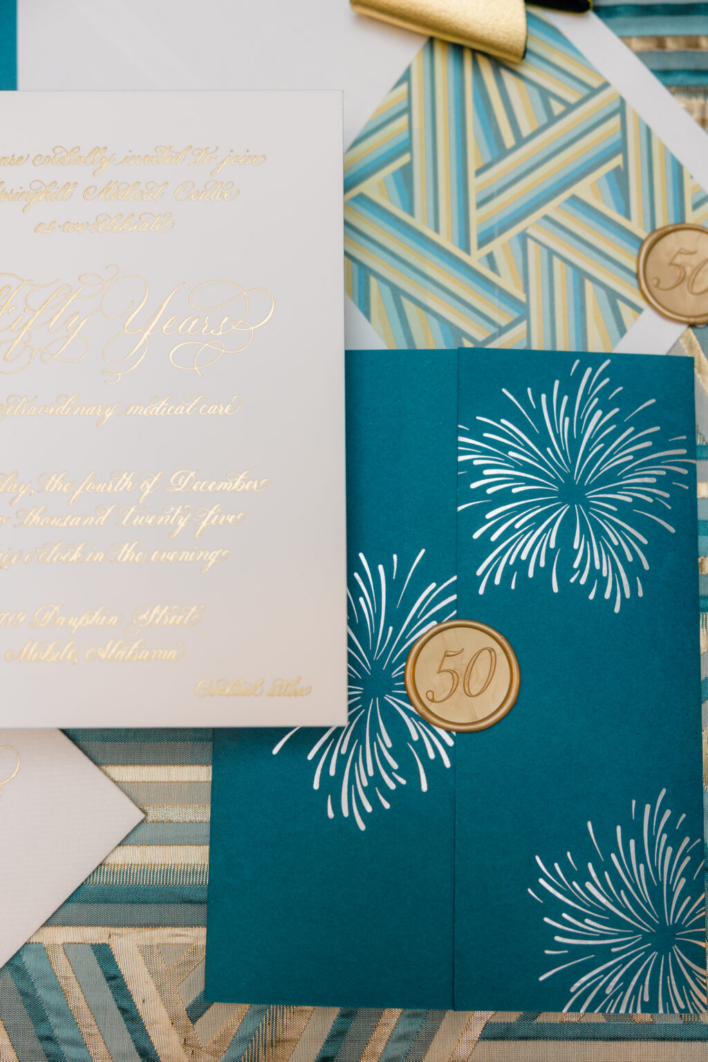
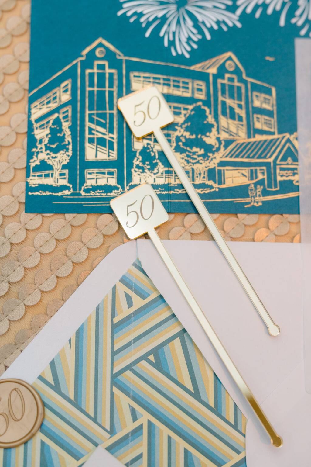
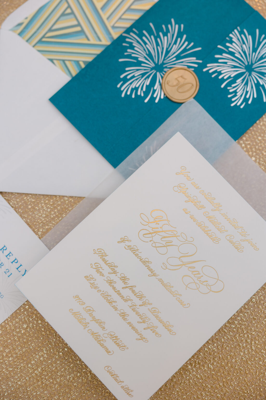
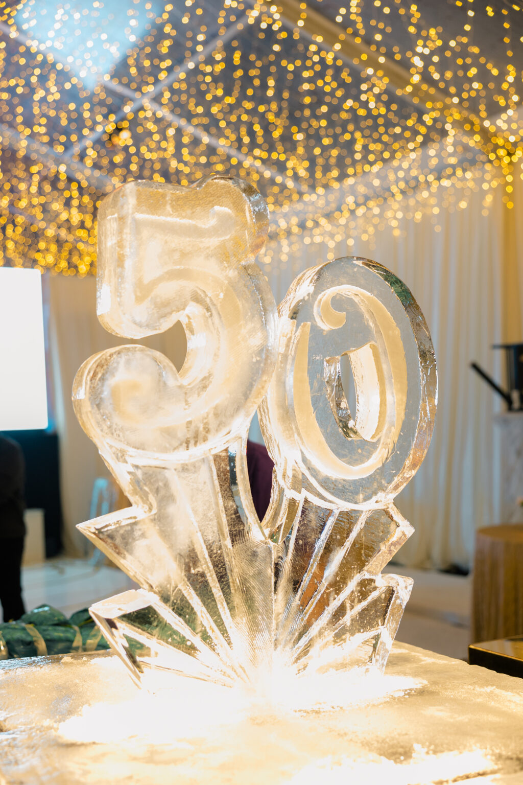
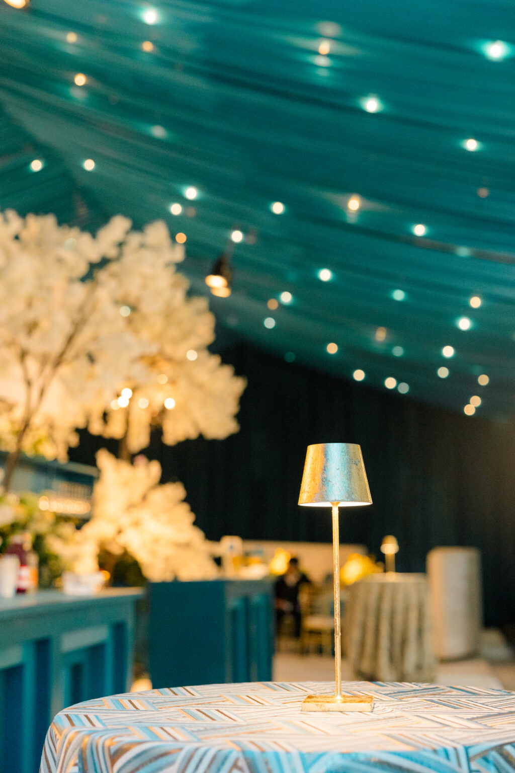
These swoon-worthy invitations with hand calligraphy set the perfect tone for a lovely celebration. Every detail was carefully selected to curate the experience and ensure a memorable evening. From a custom illustration to hand calligraphy and foil stamping throughout, see how this vision came to life. We worked with our dear friend Grace from Soirée Signatures in Mobile to create these invitations for a gala celebrating 50 years of extraordinary medical care at Springhill Medical Center.
Invitation
foil stamping: gold matte
hand calligraphy: serena
papers: bella smooth cotton 2-ply white
edge paint: calypso
card size: f-8 for inner envelope
envelope liner: classic color pattern digitally printed in PMS 9300U on white text
card size: f-8 vertical 8.31” x 12.51” flat, 8.31” x 6.24” folded
finishing: score
job: 79023
The first thing guests notice is the gatefold. This piece features an illustration of the facility along the interior panels. The illustration is foil-stamped in gold matte, while firework bursts in silver matte hover over the building. Additional bursts of fireworks appear on the front of the gatefold and set the tone for what’s to come.
Perhaps the star of the show is the Serena hand calligraphy by Virginia Lucas Hart. All of the text appears in intricate, ornate hand calligraphy, adding depth and a celebratory feel. The exclusive use of foil stamping emphasizes the flow of the calligraphy while adding some serious shimmer. The geometric envelope liner, which perfectly coordinates with the event’s tablecloths, lends the design a sense of structure and timeless sophistication while adding elements of modern Art Deco elegance.
Are you looking for the perfect invitations to commemorate milestone celebrations, formal events, or corporate anniversaries? Do you want something that feels polished, festive, and bespoke? Work with one of our dealers to see samples, paper swatches, and more, along with expert guidance, to create the ideal invitations for your next event!
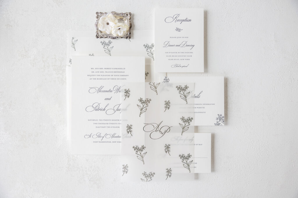
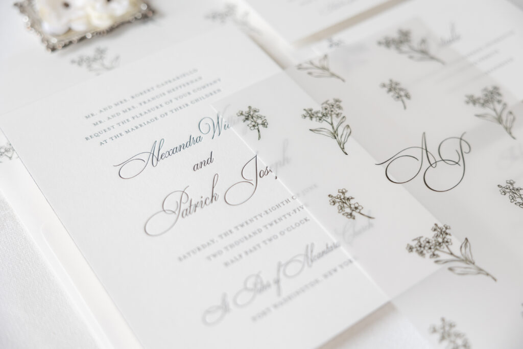
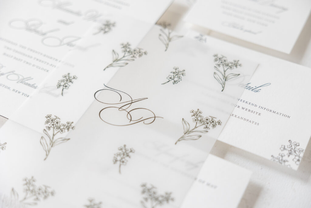
Alexandra and Patrick worked with our dear friends at Proper Notice to create their sophisticated letterpress invitations. This custom design is luxurious and stylish, and includes a lovely vellum overlay.
The elegant invitations are timeless. The traditional layout features the bride and groom’s names along with the venue in a flowing script font. Black letterpress lends the design a traditional and formal feel, while the 2-ply stock holds a deep and crisp impression.
Invitation
letterpress ink: black
fonts: ecatherina + mrs eaves
papers: bella smooth cotton 2-ply white
card size: f-8
edge paint: black
envelope liner: custom pattern digitally printed in black on white text
custom envelope: cotton text
envelope addressing: black digital on the back
job: 75254
Overlay
digital ink: black
font: ecatherina
papers: 40# vellum
card size: f-8
job: 75254
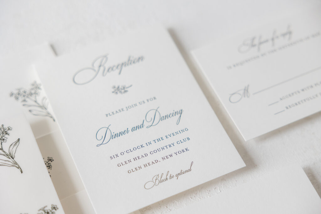
Reception Card
letterpress ink: black
fonts: ecatherina + mrs eaves
papers: bella smooth cotton 1-ply white
card size: a-2
custom envelope: cotton text
envelope addressing: black digital on the front
job: 75254
Reply Card
letterpress ink: black
fonts: ecatherina + mrs eaves
papers: bella smooth cotton 1-ply white
card size: a-5
job: 75254
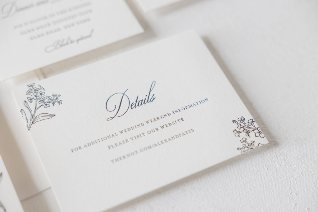
Details Card
letterpress ink: black
fonts: ecatherina + mrs eaves
papers: bella smooth cotton 1-ply white
card size: a-2
job: 75254
The bride and groom’s initials appear in the same font on the vellum overlay. Custom floral artwork also adorns the overlay. The flower sprigs are repeated to create a completely unique pattern. The same pattern is replicated on the envelope liner. Floral accents on the details and reception cards add some whimsy and consistency across the invitation suite.
Are you thinking about creating a custom pattern or adding a vellum overlay to your letterpress invitations? We can help you make that happen. Contact us directly or work with one of our dealers to create your dream wedding invitations.