Ian Koenig’s Neo Luna design is the February design of the month! This charming design features cool fonts, a touch of modern whimsy, and is on sale through February 28. Save 10% on any Neo Luna piece that you order this month: letterpress wedding invitations, save the dates, programs, coasters, menus, calling cards, and anything else you can think of. Save even more when you order your entire suite at the same time — you can get an additional 10% off when you order 6 printed pieces or more, or get free favor cards to match your invitations when you spend $500 or more! Everything about the Neo Luna design (and all of our designs!) is completely customizable — change the fonts, colors, layout and more to make it your own.

Throughout the rest of the month, we’ll be featuring an interview with Ian Koenig, the designer behind Neo Luna, along with customization ideas and other bits of inspiration to show ways this design can work for you. Have questions? Please be in touch!
The fine print: promotion is exclusive to the Neo Luna design and does not apply to the purchase of other designs. Orders must be placed by 11:59pm EST on February 28, 2013 in order to receive the promotion.
Featuring Debi Zeinert‘s expressive Revolution hand calligraphy and some flashy two tone foil stamping, this coaster version of Sarah Gluchacki‘s Gilded Romance design is intense. Don’t the gold dots look a little like champagne bubbles? Well, that’s the idea.
foil: gold shine + fuchsia shine | hand calligraphy: revolution style by Debi Zeinert | paper: coaster stock | size: 4″ | customization #: 15942 |

Picturing satin bows, dainty pink decor, luxurious letterpress wedding invitations, and a knock-out dress for your big day? If this sounds like the wedding of your dreams, then we’d like to introduce you to our Simple Bow design. Tie these pretty details together for a feminine yet modern look.

(Photo Credits: Style Me Pretty)
With a pairing of our sand and surf inks, Tara Hogan’s New Horizon letterpress wedding invitation design is looking rather fabulous. We love that the clean cut, contemporary look is played up with an oversized block font for the bride and groom’s names.
inks: sand + surf | font: barber| paper: 1-ply white | size: F8 | customization #:15219 |

Looking for a Great Gatsby styled wedding invitation? Use this Odeon customization in classic black letterpress and glitzy gold foil for an “oh so glamorous” look.
odeon = inks: black | foil: gold matte | fonts: stadium + emily austin | paper: white | invite size: F-8 | liner: simple geometrics in black | original design by Jessica Tierney | customized by in-house designer Lindsy Talarico

(Photo Credits: Easton Events)
Did you know that our Boardwalk design is the design of the month? In honor of this amazing promotion (think 10% off your total when you order any of our Boardwalk pieces!) we are dishing out some sweet chevron inspiration for our Bella brides. Think pastel pinks, gray accents and that charming chevron pattern that we can’t get enough of! From bouquets, to cakes, and even some fun accessories we have all the bases covered for you to plan the rest of your wedding details.

1. dress | 2. cake | 3. bracelet | 4. for your bridesmaids: iPhone case | 5: for your reception: chevron napkins | 6. bouquet | 7. for him: bowtie | 8. for your registry: sweet chevron pillows |
The Wedding Library submitted this minimalistic customization of our Vintage Librarie design (by Ditto Paper). A combination of charcoal and cardinal letterpress inks are carried out through the wedding suite onto the day of pieces and thank you stationery.
inks: charcoal + cardinal + blind deboss | font: knockout + courier | paper: 2-ply white | invite size: F8 | edge paint: charcoal | customization #: 15709 |

The Wedding Library was kind enough to show us the final product after they provided guest addressing services on the pieces that we initially printed. Talk about one complete suite!

Would you look at this one? What do we have here? Why, here we have a fine example of Beth Barr‘s Damask design, which we’ve printed in a combo of pewter letterpress ink and silver matte foil. Striking, isn’t it?
letterpress ink: pewter | foil: silver matte | font: impression | calligraphy: Victoria by Sarah Hanna | paper: 2-ply white | size: f8 | customization #: 15479 |

In case you haven’t heard, Amy Graham Stigler’s
Boardwalk design is the January
design of the month (and on sale for 10% off through 1/31/13!). Amy gave us the details on the inspiration behind this invitation design.
“The colors of this suite were inspired by anemones – one of my favorite flowers. I love the contrast of the pale pink petals & black center. The style is sweet meets modern. I wanted a design that was pretty and playful but had a chic edge (so it didn’t get too saccharine!). This wedding is perfect for a vibrant, fun-loving couple with lots of style.”

Image credits, clockwise from right: cake | bow-tie | macarons | bouquet
Count your lucky stars as they shine above you on your special day. Celeste, with all its mid-century vibes creates the perfect excuse to go all out with the decor.

(Photo Credits: Style Me Pretty)
Your letterpressed wedding invitations are truly the sneak peak for what your guests can expect on your big day – and these romantic and perfectly flourished Delambre Classic invitations will tell guests they’re invited to an elegant affair.
inks: navy + pewter | font: utrecht | calligraphy: victoria hand calligraphy, by Sarah Hanna | custom calligraphy monogram | paper: 1-ply white | invite size: f8 | customization #: 15685 |

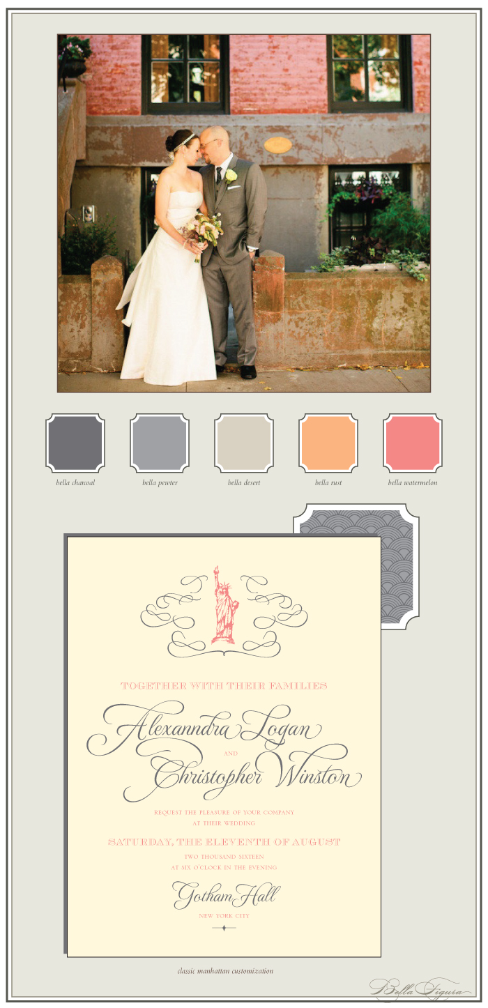
This customization of our brand new Classic Manhattan letterpress wedding invitation design is inspired by the charm of distressed brick and busy sidewalks.
classic manhattan customization = inks: charcoal + watermelon | fonts: grace + harlow + jubilant | paper: ivory | invite size: f-8 | liner: tavish pattern in pewter and charcoal inks | original design by Brenda Fox | customized by in-house designer Sarah Gluchacki |
embellishment suggestions: edge painting: charcoal

(Photo Credits: Lindsay Madden Photography)


