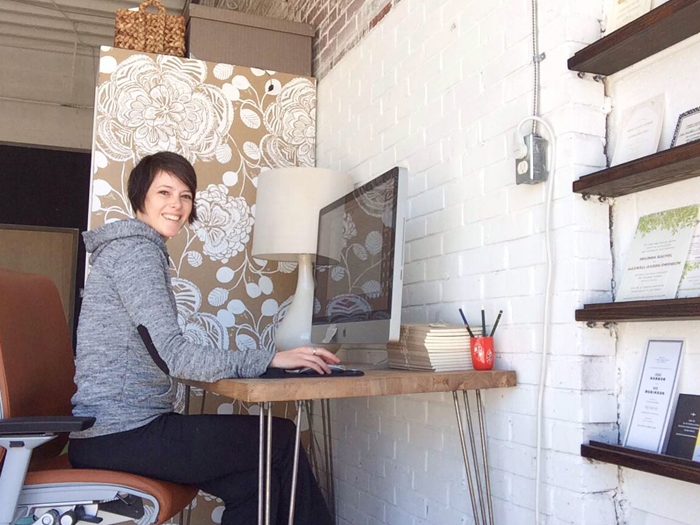
Right now, we’re featuring Ellie Snow as our Designer of the Month – that means April is all about Ellie (and all of her designs are on sale!)! We’ve been sharing some of Ellie’s design inspiration, a day in her life, and today, we’re giving you a peek inside her studio — both her former studio and her brand new, under-construction studio in the DIY District of Durham. We’ll let Ellie take it from here!
For the past couple years, the Hello Tenfold studio was in an old, rehabbed textile warehouse turned into artist studios (and before that, at my dining room table!). But this year, when a small space in a busier part of Durham, North Carolina became available, a photographer friend and I jumped on it. Just last month we moved in and are slowly getting settled. The location of the space is perfect — a short distance from my house, and across the street from a dangerously good coffee shop and many great restaurants. It’s a part of town lovingly called the “DIY district,” named for the many start-ups in the area.

Above: Ellie’s former studio

Above is a photo of the new space, which used to be a garage, before it was fixed up for us earlier this year. Our landlords removed the garage doors and replaced them with storefront windows, painted, and cleaned up a bit, but we’ve also had to get creative with ways to hide (or learn to love!) the flaws in an older building. I hired a carpenter to make some inexpensive built-in display shelves in what used to be a doorway, and we’ll cover the rough concrete floors with a variety of rugs.

Although it’s a small space, we felt strongly about having a couch to make things cozy and comfortable, and a meeting table, so we’ve also had to be careful with how much stuff we brought into the space — for me, that meant filling my basement at home with miscellaneous envelopes, paper, and old invitation samples! It felt great to pare down to the essentials, and sharing a space means I need to be a little neater (I can really make a mess, yikes). I’ve been stocking up on attractive looking storage baskets and boxes, and covered my glass front cabinets with patterned tissue paper and re-purposed table runners to hide the not always organized samples, ribbons, and envelopes inside. We have lots of touch-up painting to do. We’re shooting for early May to have a studio opening party, so there will be more peeks coming over the next month! You can see more images and current projects on my blog, Mint.
Many thanks to Ellie for letting us peek inside her new space! We’ll be back with an update when the studio is complete – stay tuned! And be sure to shop Ellie’s designs – you can save 10% on any order (or 20% if you order 6 printed pieces or more!). Start shopping now.
Using the glitz and glam of Hollywood as inspiration, Melea and Ramon customized our Glamorous Blooms wedding invitation design with Fuchsia Shine and Silver Shine foils. It’s strikingly dramatic and perfect for their tinseltown wedding.
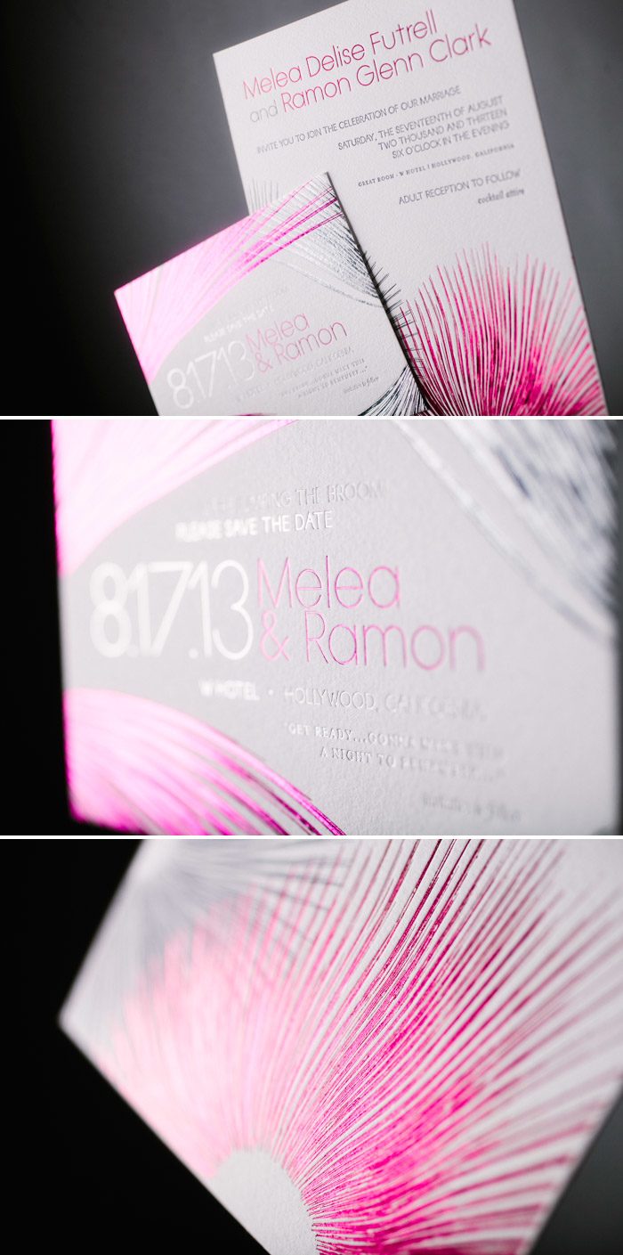
letterpress ink: charcoal | foil stamping: fuchsia shine + silver shine | fonts: moravia + statham | paper: bella cotton 1-ply white | foil edging: fuchsia shine | customization #19133 | Urbanic Paper Boutique
Ellie Snow imagined a formal destination wedding with simple yet exotic touches when she created her Analina invitation design for our 2014 collection. Playful yet worldly, the Analina design is bursting with romance, and calligraphy accents from Sarah Hanna up the elegance factor on this pretty invitation design. Check out Ellie’s Analina Pinterest board to see even more inspiration for this new design! And be sure to shop all of Ellie’s invitations – you can save up to 20% on all of her designs this month (learn more!)!
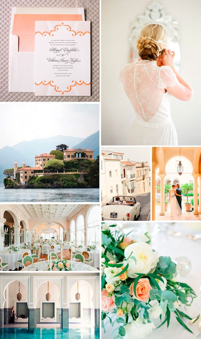
From top: Analina | bride in Jenny Packham | Villa de Balbianello on Lake Como, Italy | streets of Portugal | bride & groom | wedding reception | floral centerpiece | Moroccan hotel
Franziska and Samuel chose our industrial inspired Lumos wedding invitation design, complete with a custom folder, metallic envelope liner and bold Red Shine foil. They asked guests to “sparkle, shine and look divine” for their modern Zurich hochzeit (that’s German for wedding).

letterpress ink: charcoal | foil stamping: red shine | fonts: sans capitals + impression + popular | paper: bella cotton 1-ply white | envelope: bella cotton white | envelope liner: metallic silver | customization #19400
Overflowing with glamour, the Pemberley invitation by Ellie Snow is ideal for a vintage wedding – especially if you’re inspired by old-world elegance and luscious, cascading flowers. When dreaming up this design, Ellie pictured a romantic, candle-lit wedding with dramatic touches. Love this look? See more of Ellie’s inspiration for Pemberley on Pinterest, and take advantage of this month’s special: all of Ellie’s invitations are on sale for up to 20% off from now through April 30!

Image credits, from top: Pemberley invitation | bouquet | bride | clutch | mimosas | floral-covered staircase | estate | dining area
We can’t think of a more graceful way to say thank you than with a social note featuring hand calligraphy from one of our exceedingly talented calligraphy artists. For wedding correspondence and beyond, these personalized thank you cards can be a lovely gift to the bride and groom.

We were so excited when Kate Ignatowski reached out to us about working together on a modern, New Orleans inspired shoot. The inspiration started with the venue — a hip new spot called 501 Union in Brooklyn. Kate envisioned a wedding with a New Orleans styled vibe with lots of candle-light and Spanish moss to go with the modern, refined elements of the space. We created a custom version of our Good Show invitation suite in black and camel inks, which included invitations with lined envelopes, save the dates, menus and place cards to match her mood board. Calligrapher Patricia Mumau hand calligraphed the place cards and a Cognac tasting menu for the shoot, and even addressed the envelopes in her amazing new Murdock hand! The shoot was featured today on Ruffled, so be sure to check it out to see even more gorgeous images. Many thanks to Kate for inviting us to be a part of this amazing collaboration!

Shoot Location: Brooklyn, NY / Photographer: Kate Ignatowski / Floral Design + Concept: Mimosa Florals / Venue: 501 Union (kara @ 501union.com) / Wedding Dress: Jillian Fellers / Hair: Andy Tseng / Makeup: Anny Chow / Wedding Cakes: Momofuku Milk Bar / Rentals: Patina Vintage Rentals / Assorted Decanters + Glasses: Anthropologie & West Elm / Invitation Suite: Bella Figura / Calligraphy: Primele Creative Studio / Couple: Emilia and Wil Schobeiri
Our Irving wedding invitation is the quintessential modern design – bold type and lots of white space make it perfect for any contemporary event. Kelly and Zachary embellished their Irving customization with an all over blind deboss pattern, foil stamping to highlight their names and edge painting for a pop of festive color.

letterpress ink: charcoal | blind deboss | foil stamping: silver shine | paper: bella cotton 2-ply white | edge painting: jade | customization #20058 | Paperista
We love seeing what inspires our designers when it comes to new wedding invitations. For Annadel, one of Ellie Snow’s new designs from our 2014 collection, Ellie channeled elegant natural touches with hints of golden glamour. Think lush green florals, sparkling twinkle lights, gold rimmed glassware, the prettiest letterpress and foil stamped wedding invitations, and a firework send-off. Check out more of Ellie’s inspiration on Pinterest and be sure to shop her collection – it’s on sale now through April 30!

Credits (from top): Annadel invitation | Table setting | Fern bouquet | Emerald cocktail | Emerald bridesmaid dress | Succulent + floral centerpiece | Gucci heels
This elegant rendition of our Birch wedding invitation design proves that woodgrain patterning can easily transition from rustic to urbane with some sophisticated design alterations. Using the Birch reception card as inspiration, Allison and Gabriel made the most of the woodgrain pattern by letterpress printing it with no ink – leaving behind a subtle yet striking backdrop for the lovely hand calligraphy of Debi Zeinert.

letterpress ink: umber | blind deboss | font: impression | paper: bella cotton 2-ply white | hand calligraphy: copperplate style | customization #14916 | Creative Touch
Blind deboss back patterning on this customization of the Ellipse design adds subtle texture, perfect for an elegant African safari themed wedding. The hand drawn design elements bring in a soft bohemian look that are kept from feeling too wild when paired with Maybelle Imasa-Stukuls‘ unique hand calligraphy.
ellipse customization = letterpress ink: espresso + blind deboss | font: sans capitals | paper: white | invite size: f-8 | liner: diego pattern in desert + olive | hand calligraphy accents: belle style | original design by Courtney Jentzen| customized by in-house designer Jessica Tierney

Photo credits: Sunset + Bridesmaid, Cake
Ever wonder what it’d be like to be a designer for a day? We asked Ellie Snow, our April Designer of the Month, to take us through a typical day in her life as a designer in Chapel Hill, North Carolina — check it out!
My day starts at 7:30am, when my 8-month-old Juna decides (like clockwork!) that it’s time to get up. My husband, Juna, and I like to spend a little time cuddling and playing together first thing — Juna is a morning person and we try to soak up every bit! But then we’re running late. I get dressed, pack Juna’s lunch and her bag for the nanny, and change her into a fresh set of clothes while Brendan gives her breakfast (she’s a slooooow eater) and gets ready for work. We all leave the house around 9am; Juna and I head to the nanny’s house, and Brendan heads to his job as an Art Director in Raleigh.

After I drop Juna off, I run to the gym for a quick 30 minutes, then head to my studio. I start by answering emails and sending quotes to potential clients. After the inbox is relatively cleared, I work on current projects. Today that means making edits to invitation proofs, shipping out a few sample orders, and packaging up a freshly printed suite for a bride in New York. I have a quick meeting about an upcoming collaboration, tackle my inbox again, and then head out to pick up the baby around 2pm. She goes with me to the mail shop where we ship our packages, and gets lots of “oohs” and “ahs.” When we get home, Juna naps for a couple hours, and I sneak in some more work, maybe more emails or edits, maybe a little time to focus on Hello Tenfold‘s re-brand.


When Juna wakes up, we meet a friend for a walk, and when Brendan gets home we tackle dinner and tuck Juna in to bed by 7:30pm. Our evenings vary — I’ve started taking a clay class once a week, we try to see friends, or sometimes catch up on work projects. Some nights we watch something romantic and relaxing on TV, like Dexter or The Walking Dead (we have a penchant for dark shows, it seems!). I fall into bed with a good book but only get a few pages in…
Many thanks to Ellie for taking us through a typical day! Be sure to shop Ellie’s Bella Figura collection – all of her designs are on sale through the month of April!

