
Letterpress and Foil Wedding Invitations with Renaissance Artwork Liner
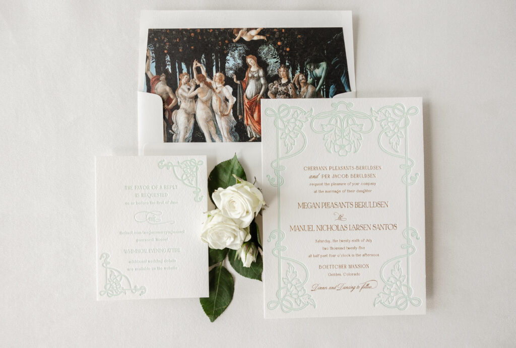
Megan and Manuel worked with our dear friend Hollis of Bering’s to create their stunning letterpress and foil-stamped wedding invitations. They chose to customize our Matilde design for their Colorado nuptials. The final design features unique details that speak to the couple and set the tone for their special day.
Invitation
- letterpress ink: sea mint
- foil stamping: gold matte
- fonts: bigilla bold + mozart script regular + noir et blanc regular
- papers: bella cotton ivory 2-ply
- card size: f-8
- envelope liner: customer-supplied pattern in cmyk digital on ivory text
- envelope: ivory cotton text
- envelope addressing: antique gold digital on the front and the back
- job: 76290
Reply Card
- letterpress ink: sea mint
- fonts: bigilla bold, mozart script regular, noir et blanc regular
- papers: bella cotton ivory 1-ply
- card size: a-2
- job: 76290
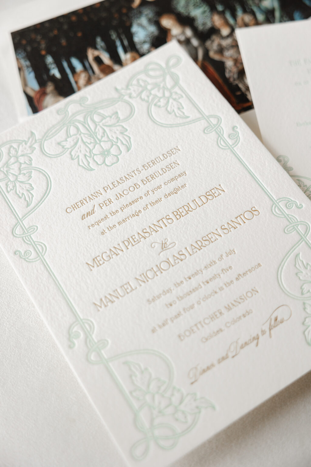
The intricate frame on the invitation appears in our sea mist letterpress ink. The light color allows the text, which appears in gold matte foil stamping, to stand out. The three fonts work together perfectly to introduce a fanciful, playful vibe while still maintaining a formal feel. The floral and foliage artwork beautifully coordinates with the garden elements of the artwork featured as the envelope liner.
The envelope liner features La Primavera, an artwork by Italian Renaissance artist Sandro Botticelli. The painting, believed to have been completed between 1477 and 1482, is located in a gallery in Florence and depicts a group of mythological figures in a lush garden setting. The painting is often interpreted as being a celebration of love.
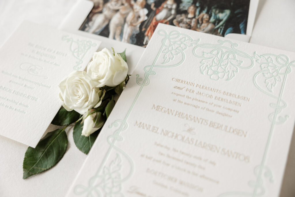
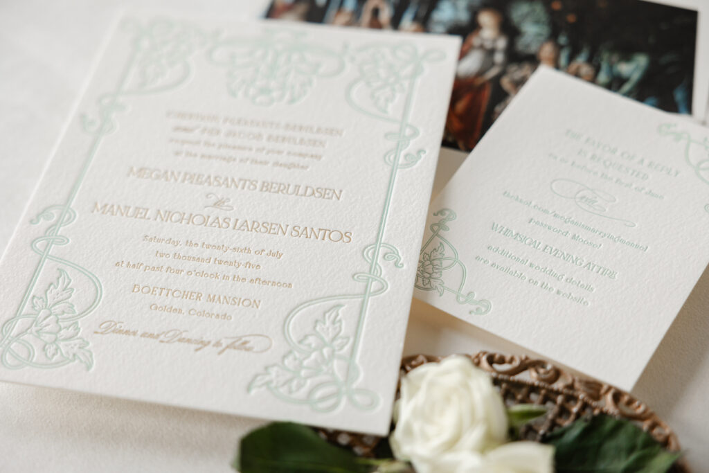
The frame from the invitation was reimagined for the reply card. Breaking apart the artwork and using components of it in two corners maintains the consistency and formality without being identical. The reply card features the same fonts used in tandem to create an eccentric feel, perfectly suited for this whimsical affair.
Megan and Manuel’s letterpress and foil wedding invitations are lovely and personal, and it was a pleasure to help bring this couple’s vision to life. Whether you want to create an aesthetic with typography, use artwork for the envelope liner, or add personal details to celebrate you and your partner, we can help make it happen. Contact us to learn more or work with one of our talented dealers to create your dream wedding invitations.