Incorporating calligraphy into your letterpress wedding invitations strikes us as one of the season’s best wedding trends. Actually, calligraphy has been a popular design element for, oh, several hundred (or thousand?) years, but we’ve been seeing calligraphy a whole lot in our favorite wedding invitations this year. Though script fonts are great, nothing – absolutely nothing! – compares with hand lettered calligraphy, where every single letter is a totally unique work of art. Bella Figura’s calligrapher is the amazingly talented Debi Zeinert, who has been making our letterpress brides so happy for years now.

So for the next few posts, we’ll focus on some really gorgeous calligraphy invitations. Let’s start with this Nonpareil invitation – it’s honestly one of the prettiest things we have ever seen! And what an inspired customization too (check out the Nonpareil original invitation here). It’s true, we’re letter junkies over here, but check out the calligraphy accents: look at that A! The M! Just lovely. Clients can choose from about 10 different styles of calligraphy, but this style (the Clermont style) feels perfect: modern, elegant, with a little bit of cool. Also note that both the reply information AND reception information is on the invitation itself – it’s eco (less paper!) and keeps cost down too (no reply card/envelope/reception card to worry about!). Colors are black & fuchsia – so perfect!

We think it’s smart to do the thank you note and coaster in 1 color, to keep costs down. If you’re trying to save money, keep the 2 color design for the invitation, and do the rest of the pieces in 1 color.

Learn more about letterpress calligraphy designs at Bella Figura, or about having your envelopes addressed by our calligrapher as well.

To further celebrate the Somersby design, here is a letterpress save the date in super sweet colors: daffodil & pewter. These shades of yellow and gray just joyfully sing about all that is good in summer to us. We’ve been hearing a lot about the beauty of gray lately too and you know what? Everyone raving about that color is absolutely right. Gray is sophisticated, warm, and perfect for letterpress invitations right now.

Excuse us if we gush about the colors of this letterpress wedding invitation (in the Somersby invitation design) but — we are in love with these colors! The inks are perfect and stylish and sophsticated shades of pink: papaya & fuchsia that play off each other and interact in this lovely way. And check out the reply card – mainly papaya, but with a line of fuchsia (wow!). Monochrome colors will be a hot wedding trend for 2009, we’re predicting. You choose a color, then choose shades of those colors, and then everything looks perfect together. Monochrome colors offer a clean, eye-pleasing look, and make choosing flowers, decor, and even bridesmaid dresses easier (choose any shade of pink, for instance!). Monochrome letterpress wedding invitations are (trust us) also very, very pretty. Enjoy!


Here’s a sweet keepsake letterpress coaster that would fill any guest with joy. The design is from our Majorca letterpress wedding invitation suite. (see more photos of our letterpress coasters here)

We’ve always loved letterpress wedding invitations in 1 color — elegant & sophisticated and, if the ink is right on, it’s just perfect. And the good news, if you’re on a budget: 1-color letterpress is always less expensive than 2-color designs (and keep in mind you can print the invitation in 2 colors, and the accessory pieces in 1 color). Almost all of our 2-color wedding invitation designs can be printed in just 1 ink, but here are our some of our favorite 2009 letterpress invitations featuring just one perfect single color.
1-color designs pictured below, starting in upper right hand corner, going clockwise: Marais // Cartoccio // Urbanity // New Calligraphy // Birds // Sevilla

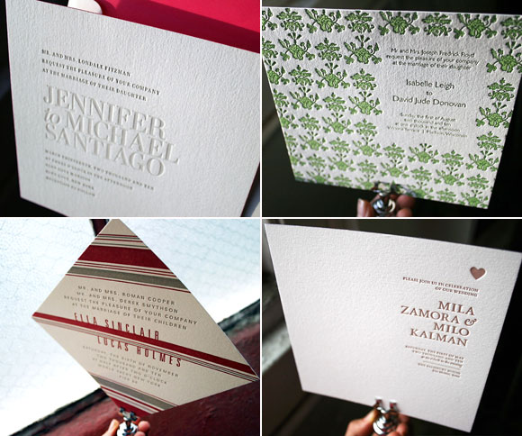
We love traditional rectangular letterpress invitations, of course, but we’re predicting a twist on the traditional: square and horizontal wedding invitations. Both sizes feel very fresh and stylish to us right now.
square designs pictured below, starting in the upper right, going clockwise // Festoon // Amici // Ella // Irving
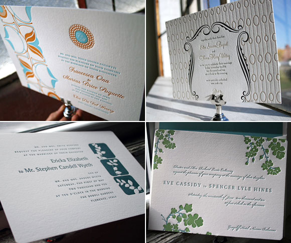
horizontal designs pictured below, starting in the upper right, going clockwise // Silhouette // Mimosa // Ericka // Onalisse
What’s going to be hot in the letterpress wedding invitation world for 2009? Well, we looked into our crystal letterpresses and our first prediction is…
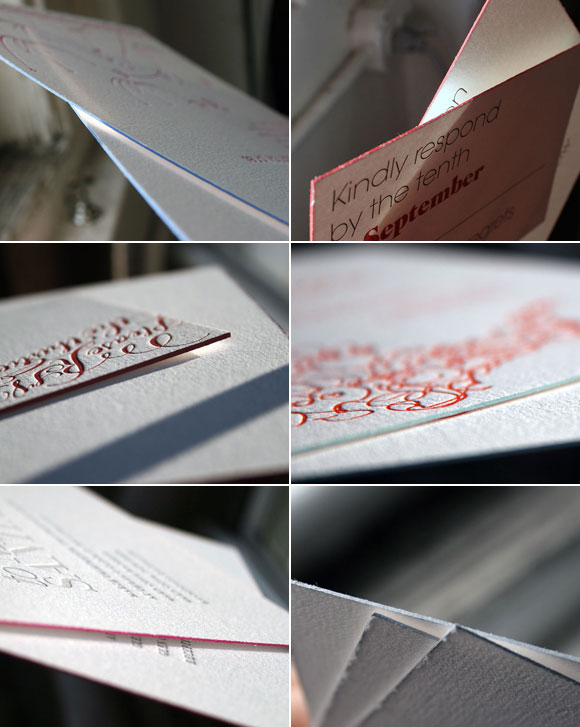
Edge painting. What is it? Originally reserved for the finest hand-bound books, edge painting has a rich history in the letterpress world. For centuries, master book binders would gild the edges of books with gold–or paint an actual illustration on the edge of the book’s pages–to show just how precious a particular book was. We’ve put a modern spin on this practice by hand painting the edge of our invitations with our Bella inks. You’ll see the color on the outside edge of the piece, but not on the front or back of the paper. Because the cotton paper we print on is so thick, edge painting can be a great way to highlight a color in your invitation set,or add an entirely new ink. (read more about edge painting wedding invitations here)
designs pictured below, starting in the upper right, going clockwise // Avant with cardinal edging // Festoon with pool edging // Urbanity with silver edging // Irving with fuchsia edging // New Calligraphy with cardinal edging // Birds with navy edging