
Inspiration
Take a peek at what's inspiring our talented team of invitation designers.
-
 Choosing Letterpress Wedding Invitation Pieces
 -
 Lovely Nantucket Wedding Invitation Customization
 -
 New Bella Figura Trendsetters – decor8 and Southern Weddings Magazine
 -
Green Weddings Event
-
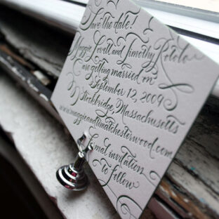
 A few favorite letterpress save the dates!
 -
 New Letterpress Reply Cards, Postcard Style!
 -
 Heartbreakingly sweet calligraphy letterpress escort cards
 -
 Timeless calligraphy accents in the Riveria letterpress wedding invitations
 -
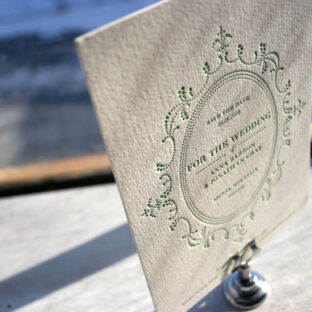
 Use calligraphy in your letterpress save the date card!
 -
 Monograms and more calligraphy in letterpress wedding invitations
 -
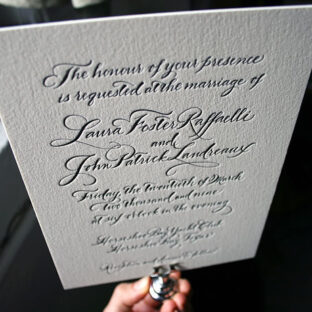
 How to make your letterpress wedding invitations truly unique? Calligraphy!
 -
 Cool wedding invitation trend: monochrome colors!