
Design Customizations
Check out the unique customizations that our customers have created by personalizing our 350+ wedding invitation designs.
-
 Custom Letterpress Baby Announcement
 -
 Festive Buttonpom Letterpress Rehearsal Dinner Invitation
 -
 Lovely Cartoccio Letterpress Invitations
 -
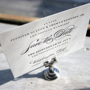
Nautilus Letterpress Save the Date
-
 Bella Bride – Letterpress Wedding Invitations
 -
 Custom Deveril Letterpress Wedding Invitation
 -
 Letterpress Wedding Invitations in 1 Color
 -
 New Calligraphy Letterpress Invitations
 -
 Fun Seasonal Letterpress Customization – The Perfect Invitation for Spring (or Summer or Winter or Fall!)
 -
 Lovely Nantucket Wedding Invitation Customization
 -
 Deveril letterpress save the dates: a classic in black ink
 -
 Timeless calligraphy accents in the Riveria letterpress wedding invitations