Behind the Scenes of the 2025 Wedding Release with Designer Katie Magee
Our wedding release is easily one of the things I look forward to most each year. It’s a time to explore new styles from trendy to timeless, spotlight new offerings from our library, and push the boundaries of what we can do.
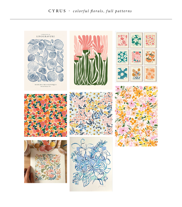
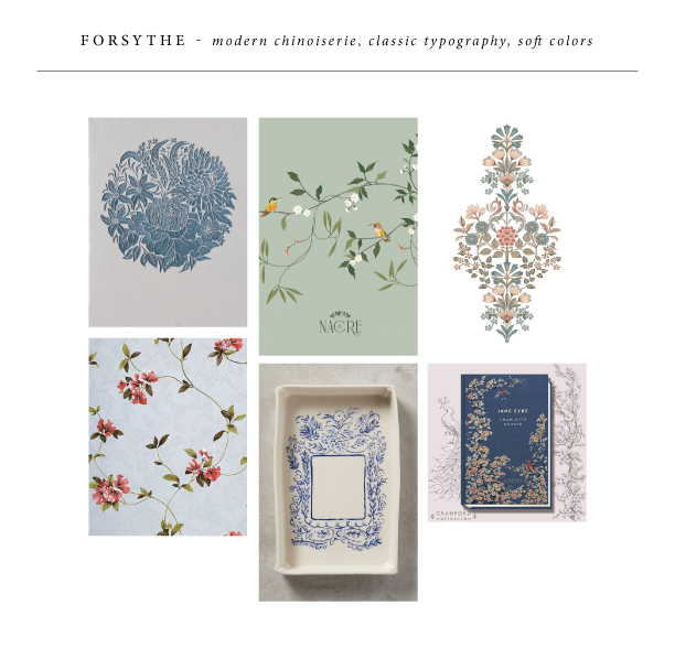
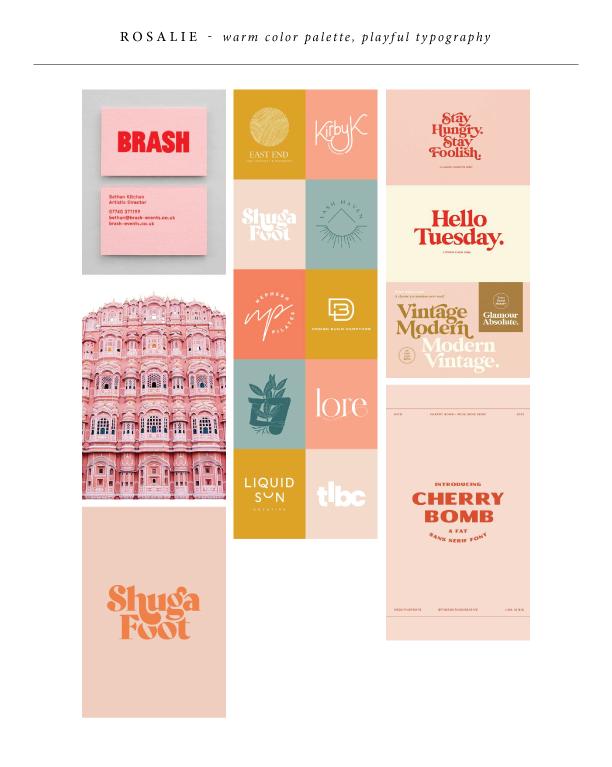
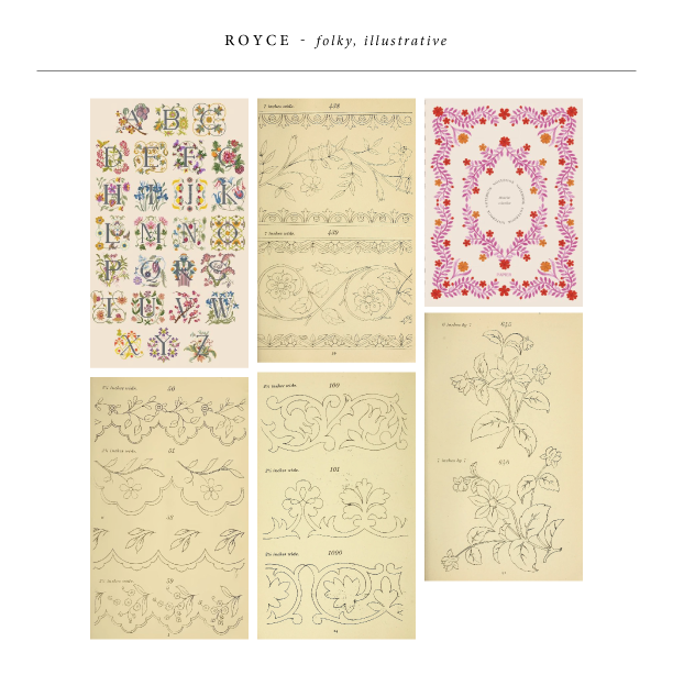
The open-endedness can truthfully be a bit daunting for me. Sometimes, a concept comes together quickly; other times, it takes a while to come to fruition. Regardless, the start of the process for me is always the same — a trusty Pinterest board. I start by pinning anything that catches my eye: patterns, color palettes, artwork, photos, anything. From there, I sort through everything, grouping what feels cohesive, allowing me to see the things I’m drawn to and start to conceptualize my new designs for the wedding release.

Cyrus
Cyrus was born from dense florals, fun colors (I had to use our new Verdigris, Lilac, and Rouge inks here!), and modern typography. Creating these florals that fit together like puzzle pieces was quite the challenge, but it brings almost an art print feel to the set.

Forsythe
Forsythe was one of those ones that came together quickly — my inspiration led me to an updated, modern chinoiserie feel. A delicate, hand-drawn floral branch is utilized throughout the set. The soft blue inks beautifully contrast with the pale ribbon and velvet accents. Our belly band assembly set up on the back of the invitation has been a hit. The custom die-cut tag felt like the perfect way to elevate that.

Rosalie
Rosalie came from a color palette that seemed to catch my eye — soft pink and bright red. This was the perfect place to show off our new Ballet paper and Chili ink, with tonal accents in Bellini. I knew whatever direction this took, it had to be fun and playful. A vintage Palm Springs vibe felt right, with cheery illustrations and whimsical typography.

Royce
Royce was the last design to come together, but it may just be my personal favorite. This set came alive from vintage embroidery transfers that I stumbled upon. I started with the flower digital illustrations you see on the folder, invite, and save the date. Then, I created the additional borders for the other pieces. It feels a little chaotic, but at the same time, cohesive. My favorite part about this is easily the folder — I think it perfectly showcases the entire set without one piece overpowering the other.

