
Tone-on-Tone Printing
There is something subtle and classic about tone-on-tone printing that elevates the look of a piece. We have been enjoying the tonal printing trend for a while now and are excited to share examples of this trend from our latest release.
Green with Style Envy
Darcy Save the Date
- Letterpress ink: olive
- Fonts: scotch display compressed + claudya script + orator std
- Paper: spruce 2-ply
- Card size: a-6 (tier 2)
- Foil edging: tawny shine
The reaching vines, foliage, and flowers of the Darcy save the date are perfect for a garden bash. The olive letterpress printing is darker than our 2-ply spruce paper, so there is plenty of contrast for ease of reading while still showcasing a tonal look.
Darcy Invitation
- Letterpress ink: olive
- Foil stamping: tawny shine (invitation + envelope)
- Fonts: scotch display compressed + claudya script + orator std + monogram couture
- Papers: sage velvet + moss duplexed 2-ply (invitation) + moss 1-ply (mounting card)
- Invite size: f-8 (tier 3) | mounting card size: custom cut 4.81 x 6.44 (tier 2)
- Silk ribbon: moss
- Edge painting: olive
- Liner: darcy pattern in tawny shine on moss text
- Envelope: latte
- Digital addressing ink: olive
Elwood Reception Card
- Card size: a-2 (tier 1)
- Letterpress ink: cypress
- Fonts: brandon grotesque + tan waltzing mathilde
- Paper: spruce 1-ply
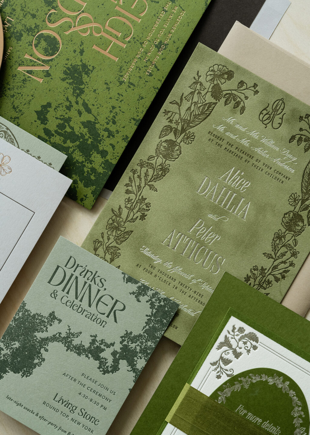
A complete monochromatic look is lovely, but you can also use the tone-on-tone concept to highlight specific parts of the design. The Darcy invitation retains some tone-on-tone appearance by pairing olive letterpress for the floral border with sage velvet. The border creates a balanced design, but utilizing the tonal look for the floral frame shifts the focus to the foil-stamped names. The names are a natural focal point due to the foil stamping, but the tonal border helps draw the eye to the names.
The Elwood reception card stays true to the tone-on-tone trend. Cypress letterpress is the perfect complement to our spruce paper. The green tones work well together and add an understated flair.
Quite Luxury
Harriet Rehearsal Dinner Invitation
- Letterpress ink: yale
- Fonts: beloved gray + ivy mode
- Paper: cloud 2-ply
- Card size: a-2 (tier 1)
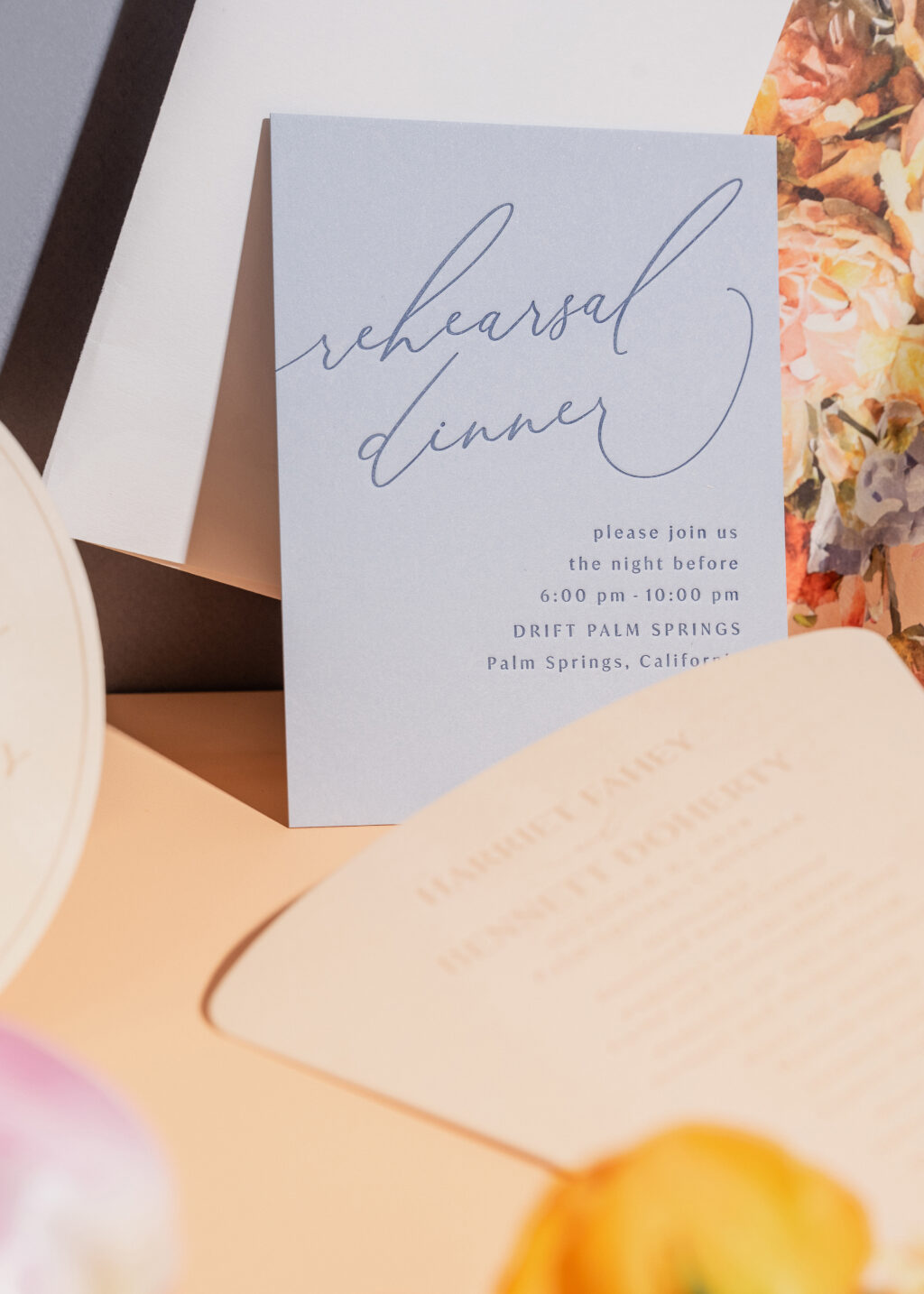
The Harriet rehearsal dinner card has clean lines and a modern feel. The simplistic design exudes the notion that less is more. The ink and paper selection follows through on this concept. Yale letterpress printing on 2-ply cloud paper maintains that simple and elegant look.
Nash Rehearsal Dinner Invitation
- Letterpress ink: terracotta
- Fonts: the original + branch
- Paper: bella handmade terracotta
- Card size: a-6 (tier 2)
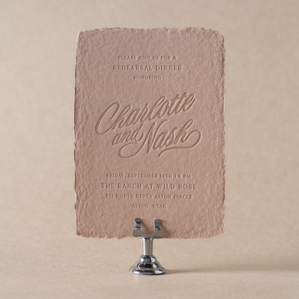
The Nash rehearsal dinner invitation delivers that same laidback extravagance but conveys more of a rustic tone. Our terracotta letterpress ink is coupled with our new handmade terracotta paper for a true tone-on-tone appearance.
Tonal Inspiration
Tone-on-tone printing can streamline a card design, or it can be a way to highlight other parts of a design. This technique is a current trend, but it has a timeless aspect. We love creating new and exciting designs that celebrate you and your event! Browse our designs to find the perfect piece, or contact us to create something original and custom.