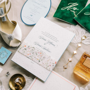
Archive for the ‘navy’ tag

New Year’s Confetti and Sparkle Letterpress Inspiration

We’re excited to start off the new year with a bit of glitz! Our Modern Fete letterpress design is fun and festive with it’s bursts of color reminiscent of confetti and tinsel that just shout a good time! For a touch of sparkle, swap our navy and fuchsia letterpress inks for indigo and purple shine metallic foils.

modern fete customization = inks: navy + fuchsia | fonts: adelais + memphis | paper: white | invite size: f-8 | liner: elegant ombre pattern in fuchsia and pale gray ink | original design by amy graham-stigler | customized by in-house designer: racheal decker

embellishment suggestions: foil edging: indigo shine

Modern Fete Invitation

(Photo Credits: Jill Thomas)

by Racheal Decker on January 2nd, 2012. Category: Invitations,Wedding Color Palettes,Wedding Trends | No comments

Fun-Meets-Formal Letterpress Invitation Trend – Edgy Edging

Featuring the gorgeous hand calligraphy of Debi Zeinert, Classic Calligraphy definitely tends to be one of our more, well, classic designs.  Throw some fresh Navy ink and vibrant Watermelon edge painting into the mix though, and you get a really great splash of bold contemporary style.  A brightly contrasting edge paint color is a wonderful way to make things fun and current without going too far overboard and loosing the vintage-inspired vibe of the overall set.  These invitations also feature a cute website card – an elegant and eco-friendly way to direct guests to your website for additional wedding details.

ink: navy | paper: 2-ply ivory | invite size: a7 | liner: antique geometrics pattern in navy | edge painting: watermelon | client coordinator: chris gannon | in-house designer: lindsy aragona

calligraphy letterpress wedding invitations


by Chris Gannon on November 3rd, 2011. Category: Design Customizations,Invitations | No comments

Hot air balloons at sunset inspire this Surya customization

A gorgeous sunset and hot air balloons as far as you can see are the perfect inspiration for this warm but playful customization of our Surya design.

surya customization = inks: amber + papaya | fonts: antoinette + knockout | paper: ivory | invite size: f-8 | liner: antique geometrics pattern in navy ink | original design by Tara Hogan | customized by in-house designer Sarah Walroth |

embellishment suggestions: edge painting in amber

funky letterpress wedding invitations

(Photo Credits: Pixel in the Box)

by Sarah Walroth, In-House Designer.

by Sarah Walroth on October 17th, 2011. Category: Invitations,Wedding Color Palettes,Wedding Invitation Ideas | No comments

Bella Figura Real Wedding: Sionne & Nick

We are absolutely delighted to share this next real wedding. We printed invitations and programs in our String Calligraphy design to set the tone for Sionne & Nick’s elegant summer wedding, and we were so thrilled when Sionne sent us photos from the big day. She was kind enough to share some of the details of what went into planning this stunning celebration.

What was your favorite part of the day?

We loved the entire weekend that we celebrated with our family and friends – it was so special to get to share one of our favorite places with everyone!  Our favorite memory of the day, however, is our actual wedding ceremony.  One of our best friends, Charles Collins-Chase, officiated our wedding and did the most incredible job.  He centered our ceremony on narratives that he requested that we both write – and not discuss with each other – to explain why we wanted to get married and what getting married meant to each of us.  Hearing each other’s sentiments for the first time in front of our guests made the ceremony really feel like our relationship was culminating in a union that everyone was witnessing.  People kept commenting that it was the most emotional ceremony that they had ever attended and it really brought the focus of the day back on our marriage, rather than just the celebration around it (which was, of course, a favorite memory as well!).

Read the rest of this entry »

by Erica Henriksen on October 14th, 2011. Category: Invitations,Letterpress Programs,Real Weddings,Reception Pieces | (2) comments

B is for Bar Mitzvah letterpress invitations!

A Bar Mitzvah is a great time to celebrate and what’s not to love about this Champagne (by Elizabeth and David Mandel)  letterpress invitation customization? Letterpressed in navy ink on our 1-ply white paper the design is perfectly complimented with a 2 letter monogram. The reply postcard is a great addition to this set. The envelope liner in reverse antique geometrics pattern ties in both the navy ink and echoes the graphic used throughout the pieces.

ink: navy  | fonts: futura + copperplate  | paper: 1-ply white | invite size: a6  | liner: the reverse antique geometrics pattern in navy ink | client coordinator: christie jones  | in-house designer: kyle laatsch

modern letterpress bar mitzvah invitations

by Christie Jones on September 13th, 2011. Category: Design Customizations,Hebrew Invitations,Invitations | No comments

Labor Day Love inspires this Harbor Beach Customization

Oh beautiful for spacious skies! A soft blue hue paired with a rich and rusty yellow makes the transition between summer and autumn look seamless in this Labor Day inspired Harbor Beach letterpress wedding invitation customization.

harbor beach customization = inks: atlantic + marigold | fonts: nysa + harlow | paper: white | invite size: f-8 | liner: the antique geometrics pattern in prussian blue | original design by Jessica Tierney | customized by in-house designer Lindsy Aragona
embellishment suggestions: edge painting in metallic gold

nautical letterpress wedding invitations

Photography- Mark Brooke Photography

by Lindsy Aragona on September 5th, 2011. Category: Invitations,Wedding Color Palettes,Wedding Invitation Ideas | 1 comment

Bella Figura Design Contest First Place Winner – Custom Letterpress Invitations from Gus & Ruby Letterpress! CONGRATULATIONS!!!

Our AMAZING friends at Gus and Ruby Letterpress in Portsmouth, New Hampshire submitted this letterpress wedding invitation set to us. We were thrilled to see the Harbor Beach design, by Jessica Tierney, used in combination with the Anais design, by Ian Koenig. The final product was styled perfectly using pewter and navy inks, clean lines and bold text. It was no surprise that this nautical yet urban design won first place in the Bella Figura Design Contest!


Read the rest of this entry »

by Lindsy Aragona on August 24th, 2011. Category: Design Customizations,Invitations,Our Retailers | 1 comment

Connemara letterpress invitations with Arabic Calligraphy

We get to work with amazing people from every corner of this beautiful world on a daily basis, but it’s not everyday we get to ship invitations all the way to Bahrain (and that’s too bad really).  These Connemara (by Beth Ann Seal) letterpress wedding invitations are printed larger than our largest standard invitation sizes.  Measuring in at an impressive 8.25″ x 8.25″ they’re so big in fact that we needed to run them on our larger 13″ x 18″ Heidelberg Windmill press (affectionately nicknamed ‘Hindenburg‘ by our printers because it tends to be a little cranky).  Sea Mist and Navy inks,  Metallic Gold edge painting, rounded corners, and hand calligraphed Arabic text, all come together beautifully here on our 2-ply ivory paper.  We particularly love the way the fluid Arabic calligraphy compliments the repeating floral motif of the background.

inks: sea mist + navy | paper: 2-ply ivory | invite size: 8.25 x 8.25″ | edge painting: metallic gold | client coordinator: chris gannon | in-house designer: sarah walroth

by Chris Gannon on August 2nd, 2011. Category: Design Customizations,Invitations | No comments

Commodore- our nautical inspired letterpress wedding invitations!

We are absolutely smitten with these Commodore (by Lindsy Aragona) letterpress wedding invitations that our friends from Gus & Ruby in Portsmouth, New Hampshire submitted for us to print!  Shown with a pairing of our navy and stunning antique gold inks-this invitation has just a touch of elegance. A perfect antique gold envelope liner makes us think of a sandy shore just off of the harbor.  We see this used for an nautical New England wedding!

inks: antique gold + navy | fonts: jubilant + salzburg | paper: 1-ply white | invite size: sq-6 | liner: the classic color pattern in antique gold ink

by Jessica Hanaman, Client Coordinator.

by Christie Jones on July 8th, 2011. Category: Design Customizations,Invitations | 1 comment

Elegant Jolie Letterpress

This stunning customization of our Jolie letterpress invitations was printed in navy ink and blind deboss for an incredibly elegant and sophisticated look. Printed on our luxurious 2-ply cotton paper, it takes on a dramatic feel and the horizontal orientation adds an extra chic touch to this design.

by Cynthia Converse on March 17th, 2011. Category: Design Customizations,Invitations | (4) comments