
monogram
-
 Blind Emboss Invites with Velvet Accents
 -
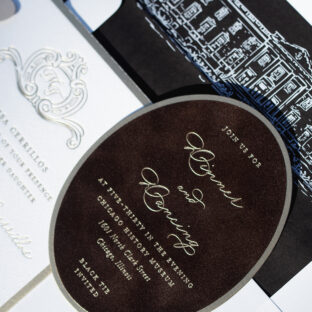
 Bold Art Deco Letterpress Invitations with Back Pocket
 -
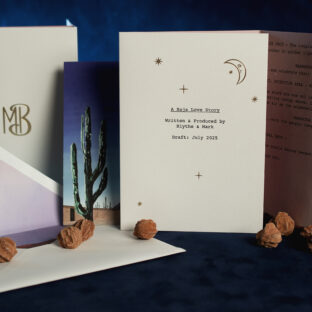 Cinematic Desert-Inspired Wedding Invitations
 -
 Regal Letterpress and Foil Invitations
 -
 Modern Classic Foil Stamped Wedding Invitations
 -
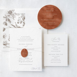
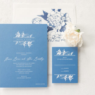
 Nature-Inspired Letterpress and Blind Emboss Invitations
 -
 Foil-Stamped Wedding Invitations with Velvet Reception Card
 -
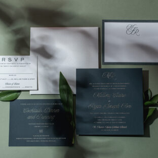
 Monogram Letterpress Invitations
 -
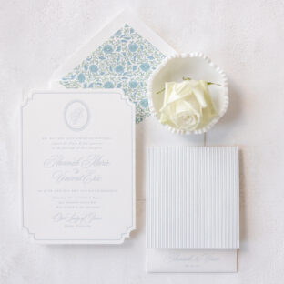
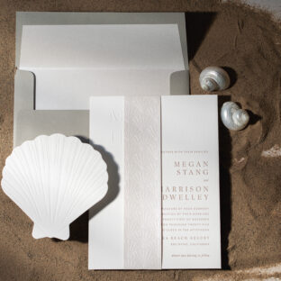 Coastal Luxury Letterpress Wedding Invitations
 -
 Traditional Foil Stamped Wedding Invitations with a Modern Twist
 -
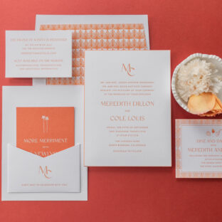
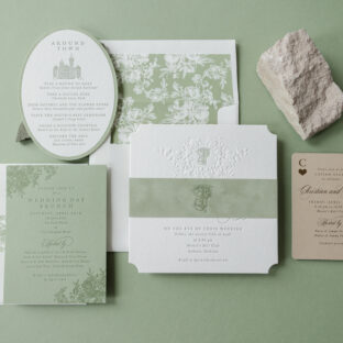 Stately Wedding Weekend Stationery Including Fun Post-Toast Card
 -
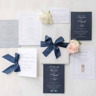
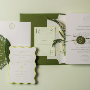
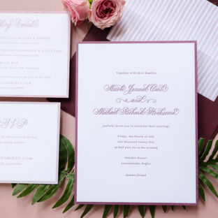 Romantic Letterpress Invitations with Hand Calligraphy