
Floral Rehearsal Dinner Invitation
This charming rehearsal dinner invitation from our friends at Paper Place sets the perfect tone for a springtime event. This is a customization of our Dendria invitation, and it’s a great example of how you can transform our designs. See what sets the customization apart from the original design and how the clients made this floral rehearsal dinner invitation their own.
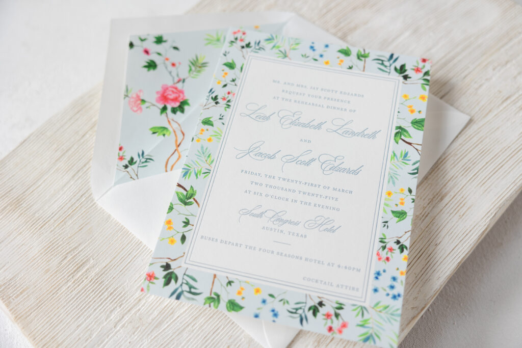
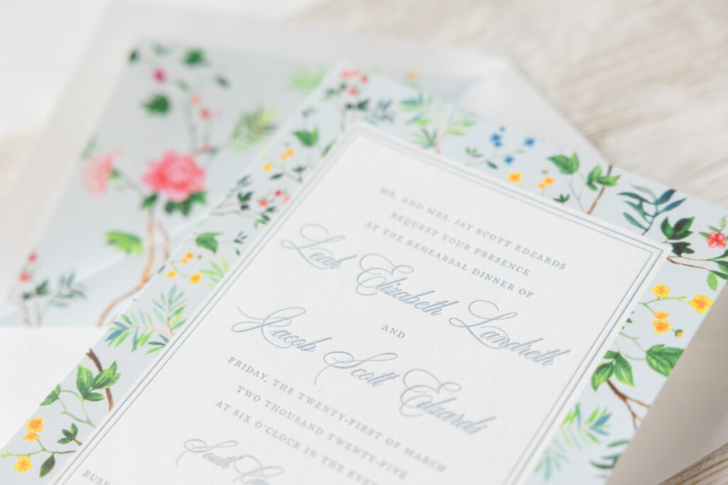
The client kept the same floral liner and used the liner pattern to create a border along the outer edges of the invitation. A double-line letterpress border separates the text from the floral frame. Different fonts were selected, but they kept the same look of featuring the bride and groom’s names and the venue name in a script font and using a serif font for the remaining text.
Rehearsal Dinner Invitation
- letterpress ink: chambray
- digital: cmyk process
- fonts: desirable calligraphy, bell MT
- paper: bella smooth cotton white 1-ply
- invite size: a-7
- envelope: a-7 pointed flap white text
- liner: dendria pattern in cmyk process + powder blue digital
- envelope printing: return and guest address in chambray digital
- job #74946
The final version does not include the blind embossed crest or the belly band, but the result is still lovely and fits into the tone and style of the rehearsal dinner and overall wedding weekend.
Reply Card
- letterpress ink: chambray
- fonts: desirable calligraphy, bell MT
- paper: bella smooth cotton white 1-ply
- invite size: a-5
- envelope: a-5 pointed flap white text
- envelope printing: address on front in chambray digital
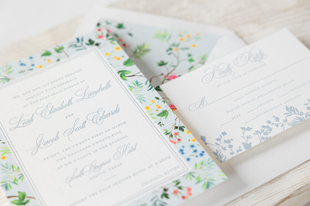
The reply card stays true to the original and features the same fonts as the invitation and single-color letterpress floral accents along the bottom. The layout was slightly reworked to include meal options for guests to select.
Do you want to create a floral rehearsal dinner invitation or customize your own Dendria? Reach out, and we can help walk you through the process!
