
Blind Deboss
-
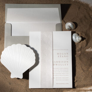 Coastal Luxury Letterpress Wedding Invitations
 -
 Dreamy Tone-on-Tone Wedding Invitations
 -
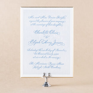
 Custom Wedding Invitation Suite
 -
 2025 Louie Award Winner
 -
 Save the Date and Coordinating Social Stationery
 -
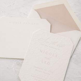
 Blind Deboss Wedding Invitation
 -
 Gold Leaf Award Winning Designs
 -
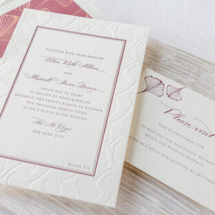
 Letterpressed and Debossed Floral Invitations
 -
 Taupe and Gray Wedding Invitations with Floral Accents
 -
 Spruce and Ivory Wedding Suite with Debossed Botanicals
 -
 colorful cortes inspired letterpress invitations made for a Mexico wedding
 -
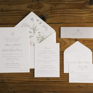
 textured letterpress wedding invitations