Meghan and Matthew worked with our friends at Bering’s to create their beautiful invitation suite. The layout mimics our Florence sample, with updated fonts in stunning rosebud letterpress and mink matte foil. Debossed Florence florals highlight the corner of the creatively worded hotel card. The suite is pulled together perfectly with mink matte edging, and the floral Calista liner in rosebud.
We are thrilled to introduce our 2024 wedding collection! This release will include 30 new wedding designs which feature our velvet papers, handmade papers, silk ribbons, lots of die cut shapes, and a new pocketfold option. You can find the 2024 collection here, and three of our favorites below.
Kaia features a jute, gold and white palette, with palm accents, embossing, and a new die cut shape
Mariana at our NYC studio worked with Blair and Max to bring their invitations to life. A previous post, detailing a customization of Jorie with a floral frame and inset double border inspired the invitation layout. We used the ginko leaf pattern from our Mirabelle design to create a debossed frame on the invitation card. This motif was then repeated in letterpress on the reply card, and foil stamped on the liner. We love the repeating motifs in different print methods!
We worked with our friends at Write Occasion to bring Eliana’s woodland themed Mitzvah invitations to life. We created a two color invitation border using the botanical pattern from our Augusta sample. The woodland theme was continued on the details card via debossed woodgrain pattern. The woodgrain appears again on the foil stamped liner. Jute paper accents are the perfect touch to add color variety while true to the theme.
We are so excited to share that our Bella Figura studio in Greenpoint, Brooklyn has been officially reopened! To celebrate, we are sharing four designs that were inspired by popular wedding venues in the area. If you are looking to make an appointment at our Greenpoint studio, you can do so through our online booking tool here! Below you will find some more details about the inspiration that helped bring these Brooklyn designs to life:
Verdant
The rustic, vintage appeal of the Greenpoint Loft set the tone for our Verdant design. The suite features illustrations that reflect different parts of the venue. The Greenpoint water tower can be found on the reply card, specifically chosen for its unique aesthetic that is visible from all points of the neighborhood. The skyline was incorporated within the suite as a draw from the rooftop view of the Greenpoint Loft.
The Verdant suite features Stone letterpress ink on our white Bella Smooth Cotton paper. The set features a vellum belly-band with the skyline printed in Stone digital ink. The envelope liner printed in Stone and Mineral adds a modern flair.
Esme
The Box House Hotel inspired the design of our Esme suite. Stunning skyline views can be found at this particular wedding venue which are reflected within the design. Clean, line illustrations can be found throughout such as special touches like a taxi motif along with a small venue illustration of the Box House Hotel on the reception card.
The Esme suite features Black letterpress ink as well as Platinum Shine foil printed on our bright White Bella Cotton paper. A black outer envelope keeps everything together with a geometric envelope liner pattern printed in Black, Cinder and Pale Gray digital ink.
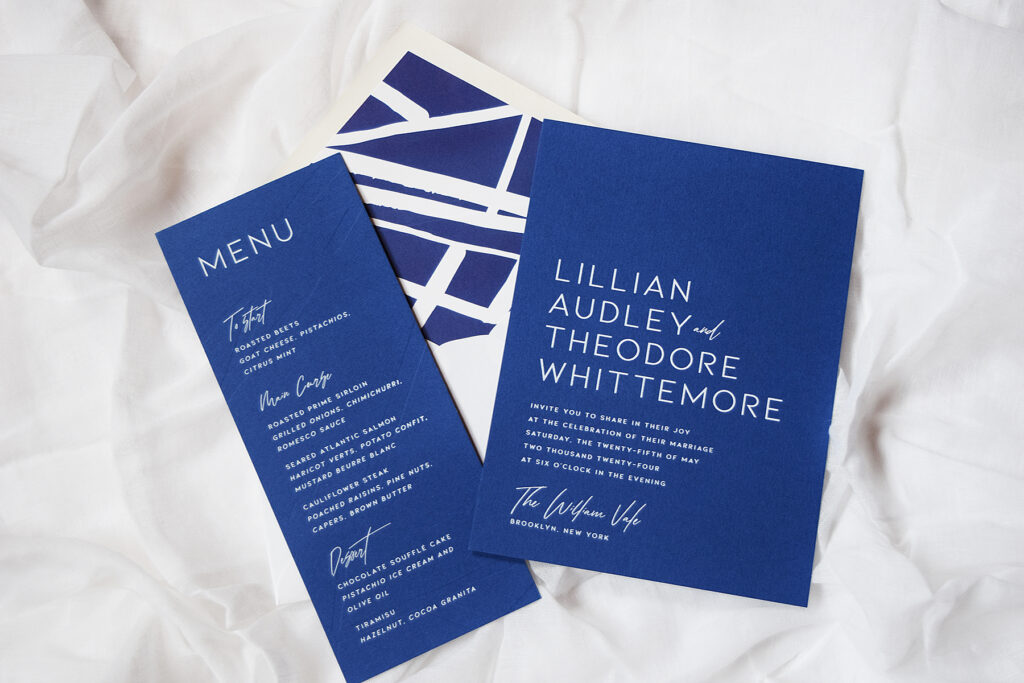
Vale
The William Vale venue set the tone for our Vale design. Known for its sweeping views near the water and architecturally distinct nature, this venue required an invitation suite that matched the scenery. Our Bella Royal paper echoed the nautical surrounding of the venue with an envelope liner to represent the architectural lines of the building.
The Vale design is printed in White Matte foil on our Bella Royal paper with Blind Deboss accents on the reverse to create texture and interest. A white envelope paired with a Royal envelope liner tied everything together from the inside out.
Kent
Giando on the Water looks out to expansive views of the beautiful skyline right on the water. The Kent design was created to mimic the venue’s elegant aesthetic. We kept the design simplistic yet intriguing to look at with touches of Brooklyn to be found throughout.
The Kent design was printed in Antique Gold letterpress on our Bella Cotton ivory paper with Gold Matte foil edging. All additional insert cards carried Antique Gold letterpress on each as well. An envelope liner of a map of Brooklyn added vintage appeal to the overall suite.
Geena and Zackary worked with our team and Union Street Papery to create these colorful cortes inspired letterpress invitations. They used blind deboss accents on the top and the bottom of the design to create a subtle, yet whimsical impact. The insert cards also carried the theme from the invitation, but with unique accents of their own to set them apart. The digitally printed envelope liner tied all the colors of the suite together. We have no doubt this wedding was one to remember!
We have put a classic twist on the modern Headline design by opting for a black and white color palette. The vibe immediately becomes sleek and sophisticated. If you intend on having an urban wedding with lots of class, this customized design is the way to go!
letterpress ink: black + blind deboss | fonts: austin + neutra text | paper: white | invite size: F-8 | liner: rule in black | original design + customization by Lindsy Talarico
Kimberly and Kenneth worked with our Bella Figura Brooklyn store to create these textured letterpress wedding invitations. Inspired by Triton, they made the design their own by using black ink rather than foil for the type. This kept the color palette easy to read. The blind deboss pattern in the background added a wave-like texture to the design. The details card followed suit with a deboss textured added to the top. They opted for a solid envelope liner to keep the design clean.
It’s not every day a little one turns one, let alone two little ones! Our Bella Figura – Manhattan store helped create these letterpress birthday invitations for Valentino and Siena. Inspired by our Lani design, we used the blind debossed palm pattern as well as on the envelope liner. Animal motifs in Cobblestone added a playful element to the set. Additionally, little Gold Matte party-hats added a pop of shine to this sweet motif. A matching envelope coordinated with the Cobblestone letterpress printed on the invitation. Finally, the envelope liner printed in Sea-Mist brightened up the overall color palette.
Bridget and Brandon worked with Wordshop to create these bright pink save the dates with tawny foil. Rather than “she said yes,” they made the saying their own with “she said si!” The couple decided to add edging to the sides of the save the date in matching tawny foil. Their envelope liner only makes a wedding venue in Mexico. The botanical pattern added an element of greenery to this vibrant set.
Our friends at Wynwood Letterpress helped us bring these subtle floral letterpress wedding invitations to life. The suite kept a monochromatic color palette. They used our Bella Light Gray paper for their envelopes as well as Fog letterpress for the typography. Blind debossed drawings of florals anchored the top left as well as the bottom right of the invitation. An envelope liner in our Marble 4 pattern added an unexpected contemporary twist to a floral forward set.
Letterpress: Fog + Blind Deboss | Fonts: Melika and Streamline | Design: Custom Library | Paper: 1 ply Bella Smooth Cotton White | Size: F8 | Liner: Marble 4 in CMYK | Customization: 47244 | Subtle floral letterpress wedding invitations with marble envelope liner Wynwood Letterpress
Christina and John created their tropical foil save the dates with the help of our Bella Figura store in Manhattan. Inspired by our Lani design, these save the dates set a tropical tone for their wedding to come. Typography in Tawny Matte foil added a subtle metallic accent to the blind debossed palm. Additionally, charcoal letterpress kept the color palette neutral for the block type. Finally, the envelope liner tied the tropical theme of this set together.