
Design Customizations
Check out the unique customizations that our customers have created by personalizing our 350+ wedding invitation designs.
-
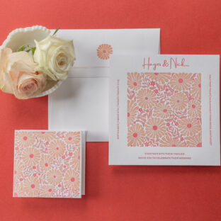
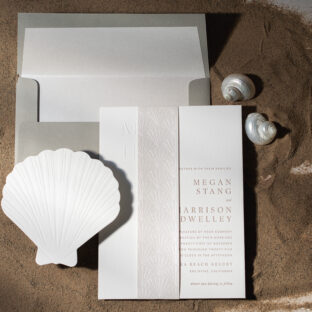 Coastal Luxury Letterpress Wedding Invitations
 -
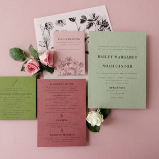
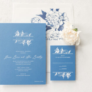 Traditional Foil Stamped Wedding Invitations with a Modern Twist
 -
 Classic Letterpress Wedding Invitations
 -
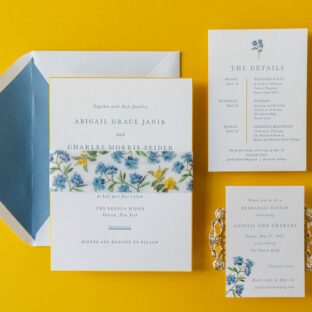
 Minimalist Mediterranean Wedding Invitations
 -
 Modern Retro-Inspired Wedding Invitations
 -
 Dreamy Tone-on-Tone Wedding Invitations
 -
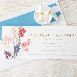 Seaside-Ready Save the Dates
 -
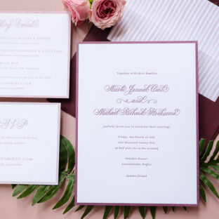 Romantic Letterpress Invitations with Hand Calligraphy
 -
 Refined Letterpress Wedding Invitation with Bevel Edges
 -
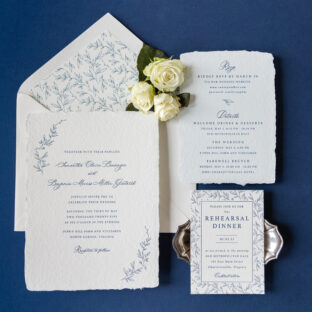 Botanical Letterpress Invite on Handmade Paper
 -
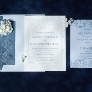 Ornate Invitations with Foil-Stamped Envelope Liner
 -
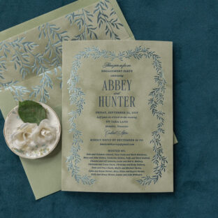 Velvet Engagement Party Invitations